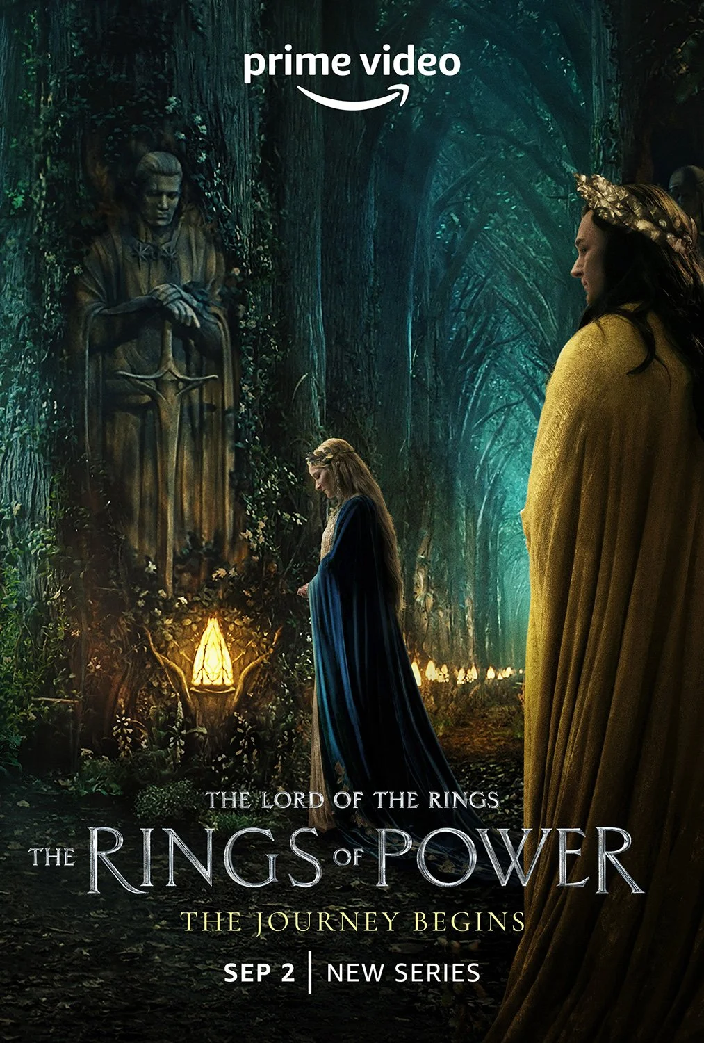
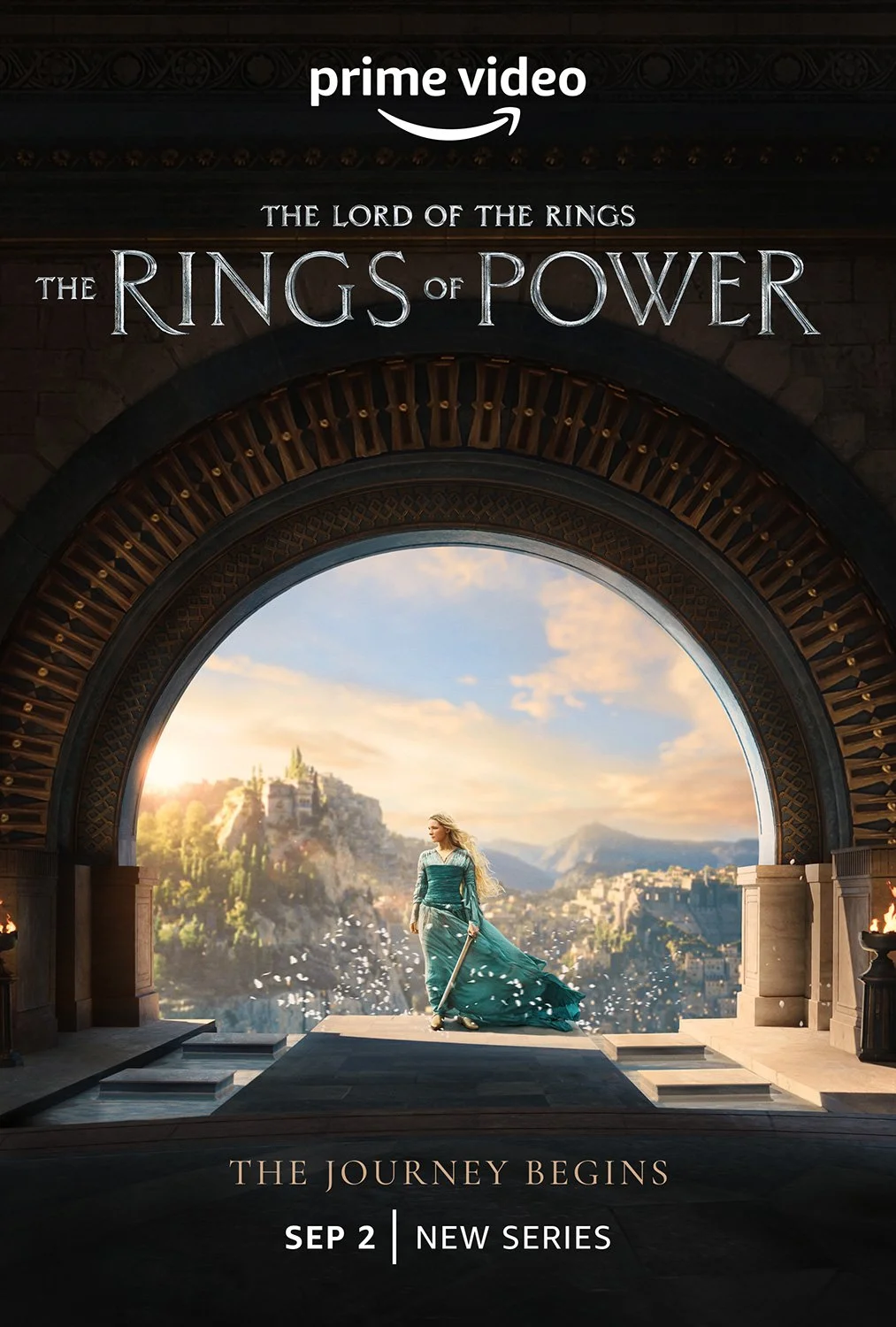
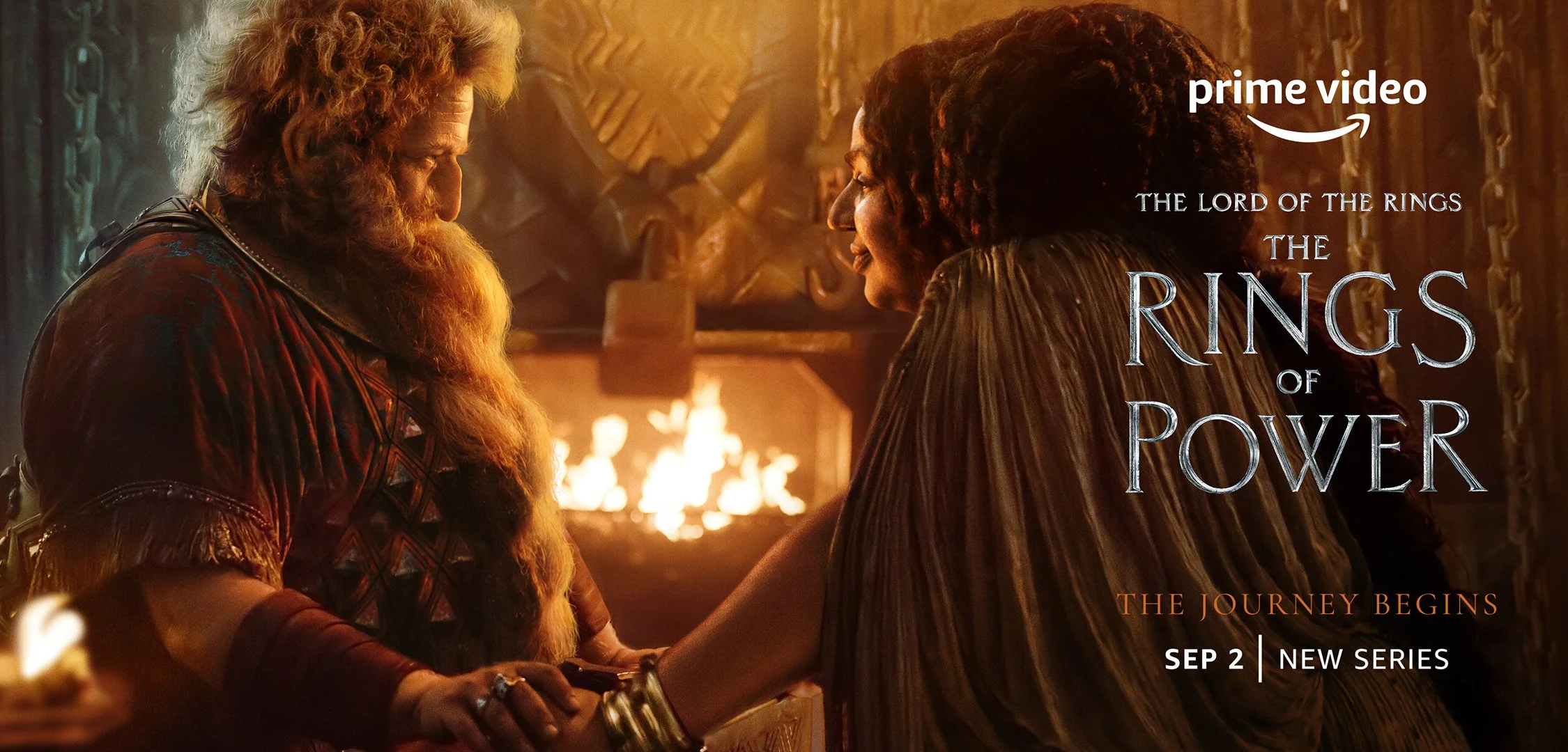
THE LORD OF THE RINGS: THE RINGS OF POWER
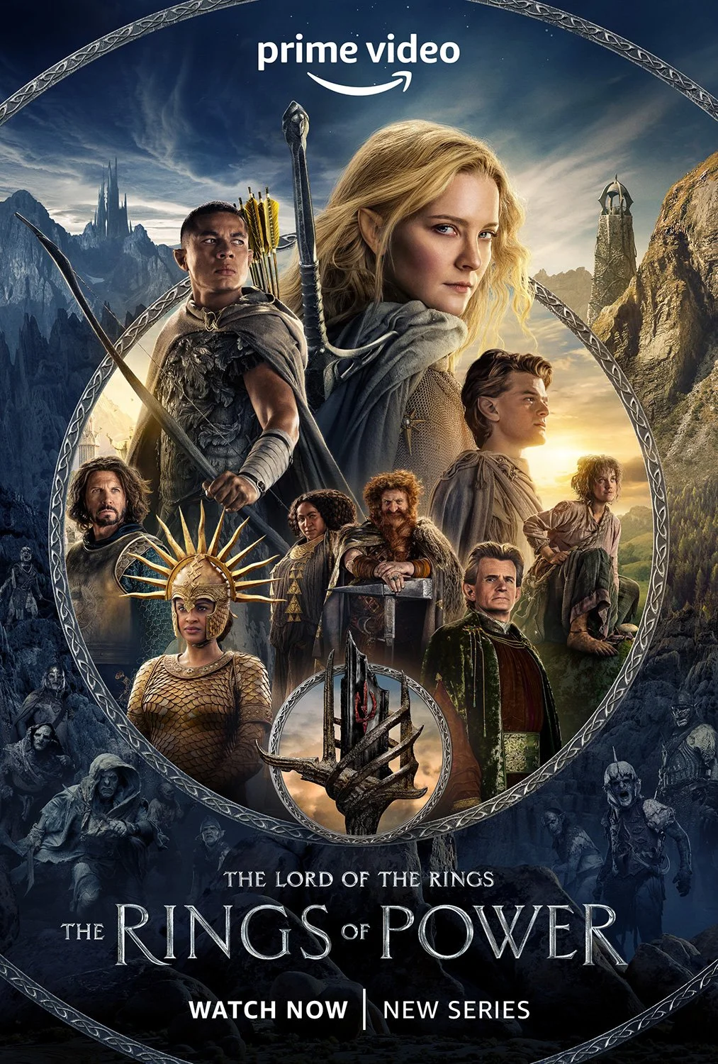
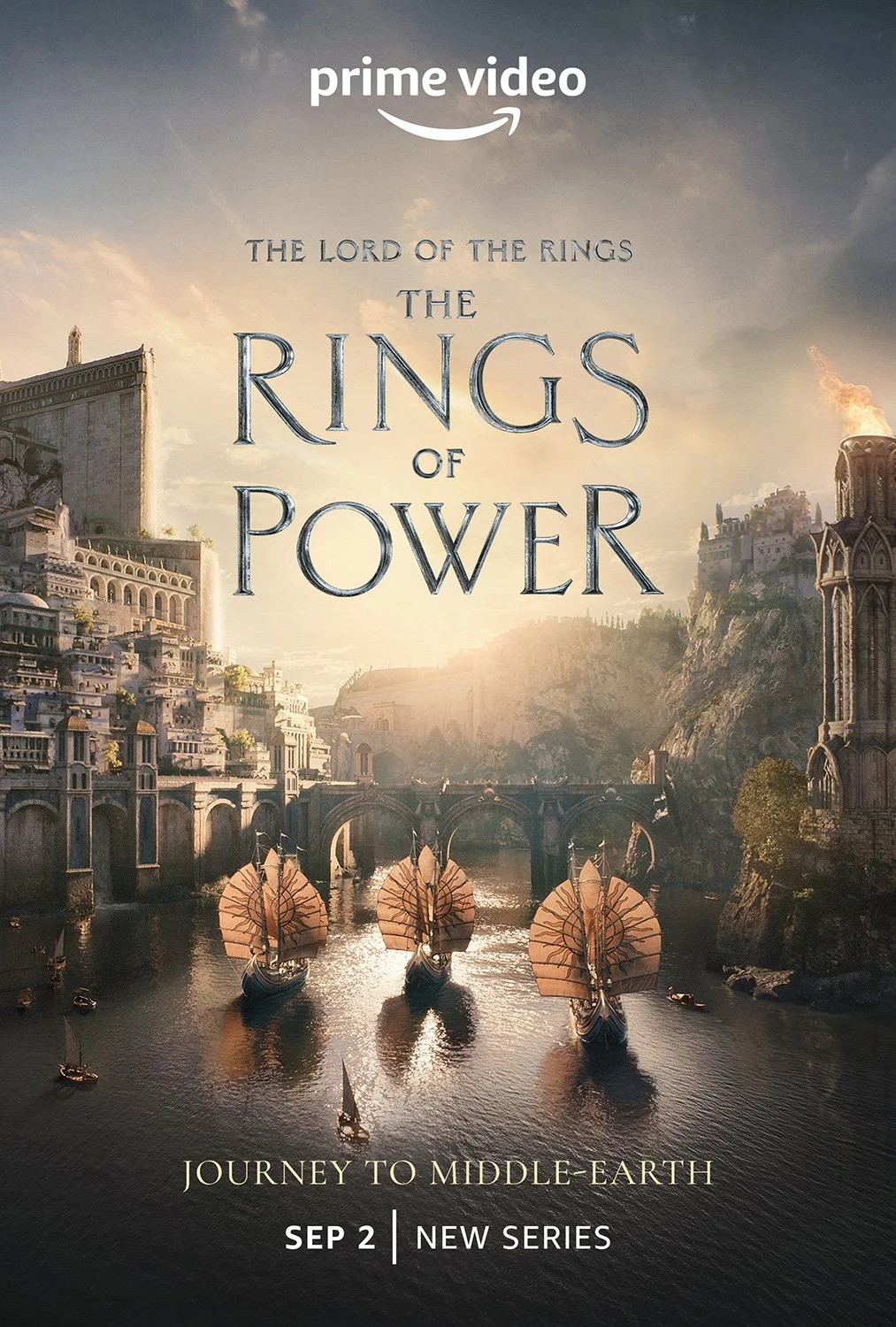
The Lord of the Rings: The Rings of Power launched as one of the most anticipated series debuts in streaming history, carrying the weight of a passionate global fanbase that had waited years to see Middle-earth return at this scale. The campaign became the most successful series launch in Prime Video history, generating more than 25 billion minutes watched worldwide.
I led the art direction for the full campaign, directing design agencies, production partners, and international teams to establish and maintain the visual language across every touchpoint: from the forged title reveal and character hand campaign to global OOH, packaging, partnerships, and international rollout. The creative challenge went beyond selling the show at global scale. It demanded artistry, storytelling, and excellence down to the pixel. Every asset had to feel authentically Middle-earth, cinematically premium, and consistent across a massive volume of deliverables produced under compressed timelines with the studio, partners, vendors, and international teams working simultaneously.
The biggest challenge was maintaining the creative and narrative bar: pushing partners toward the level of craft the IP demanded while managing the competing pressures of speed, stakeholder complexity, volume, and cost without letting quality slip.
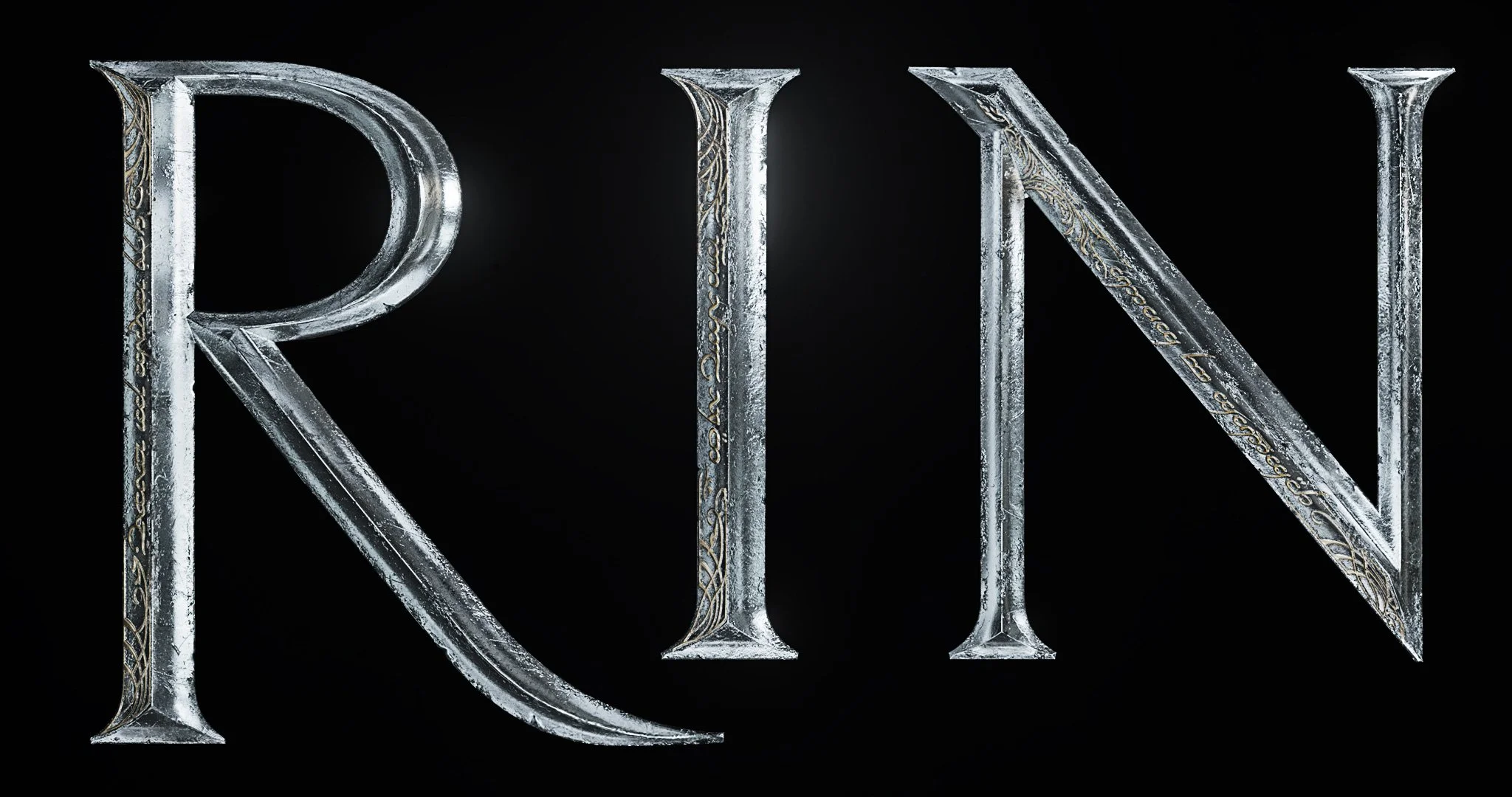
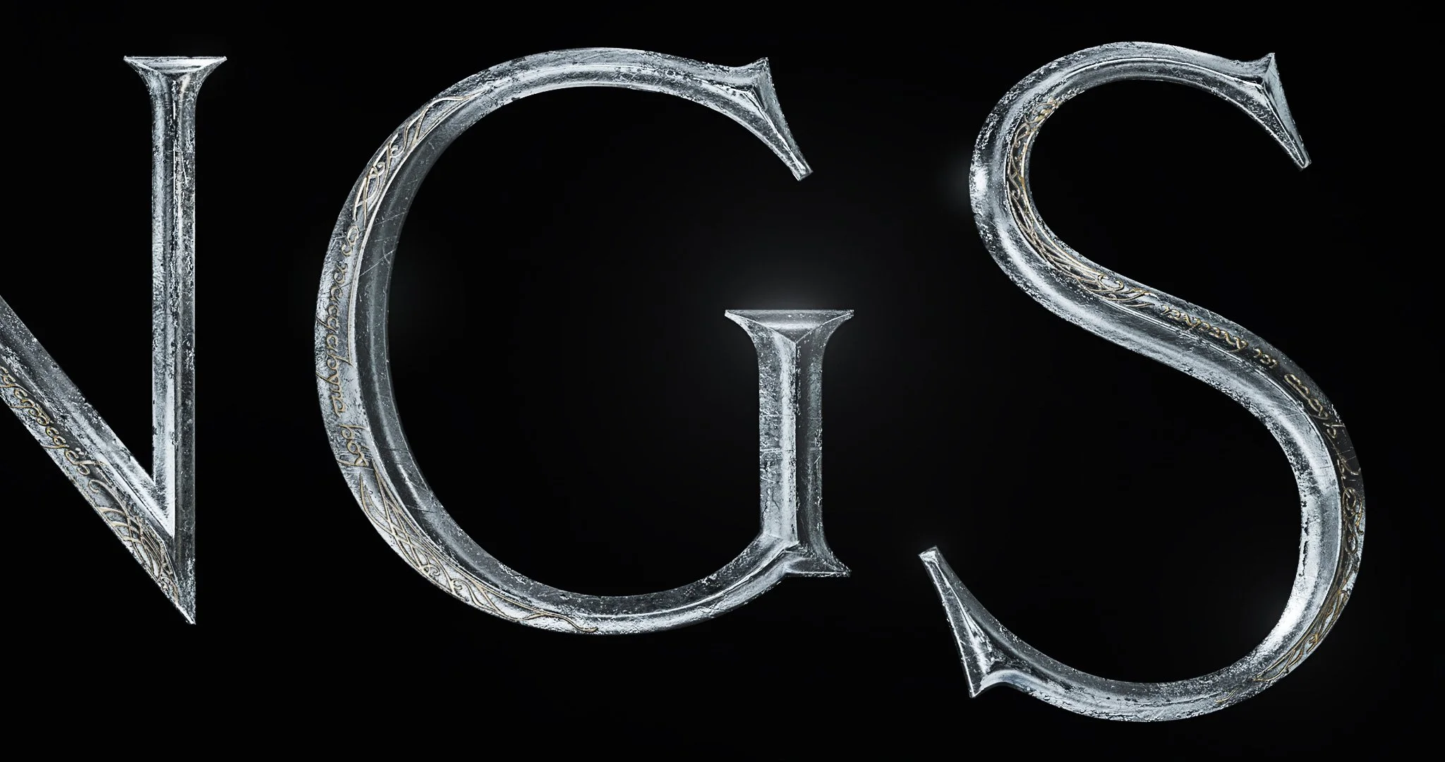
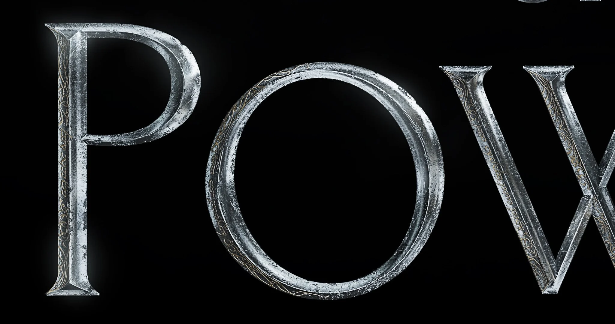
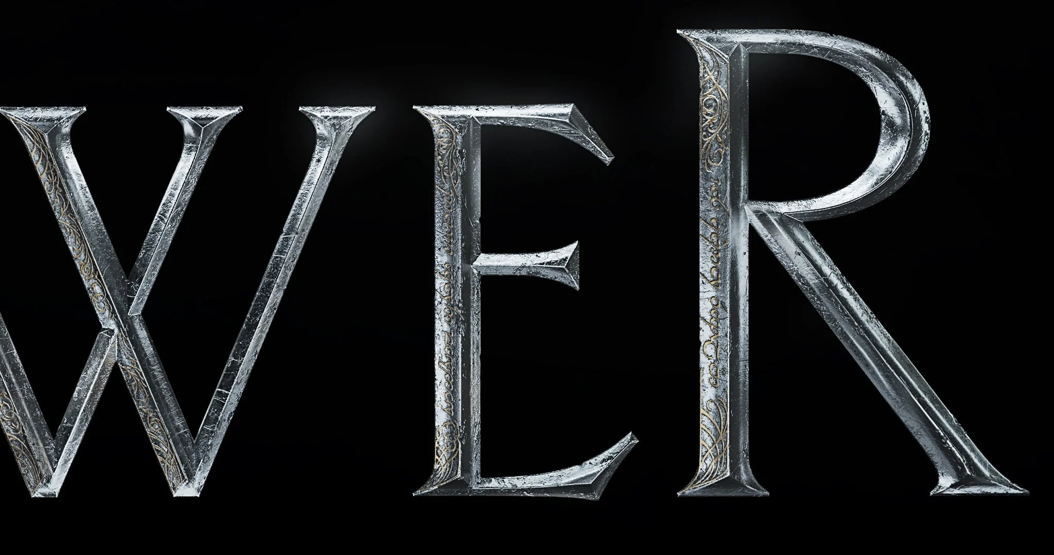
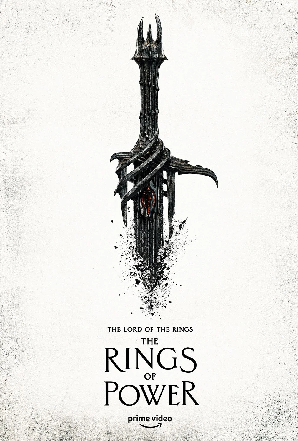
FORGED TITLE REVEAL
2022 Clio Entertainment Grand Award Winner Category: Brand & Program Identity, Logo
LOGO
The title reveal was the first major beat of the marketing campaign, which made the logo design the earliest and most critical creative challenge. I conceived and art directed the title treatment in close collaboration with our design agencies and legendary VFX company ILM, bringing a level of specificity to the process that went far beyond a typical title design.
With my guidance, the final treatment was crafted to evoke the in-world metal called Mithril, with intricate Elvish inscriptions embedded throughout the letterforms. Beyond direction, I refined elements hands-on throughout the process, balancing craft and execution while navigating a complex stakeholder environment across creative teams and executives.
The result became a foundational visual element of the global campaign, later adapted into more than 30 localized versions for international rollout.
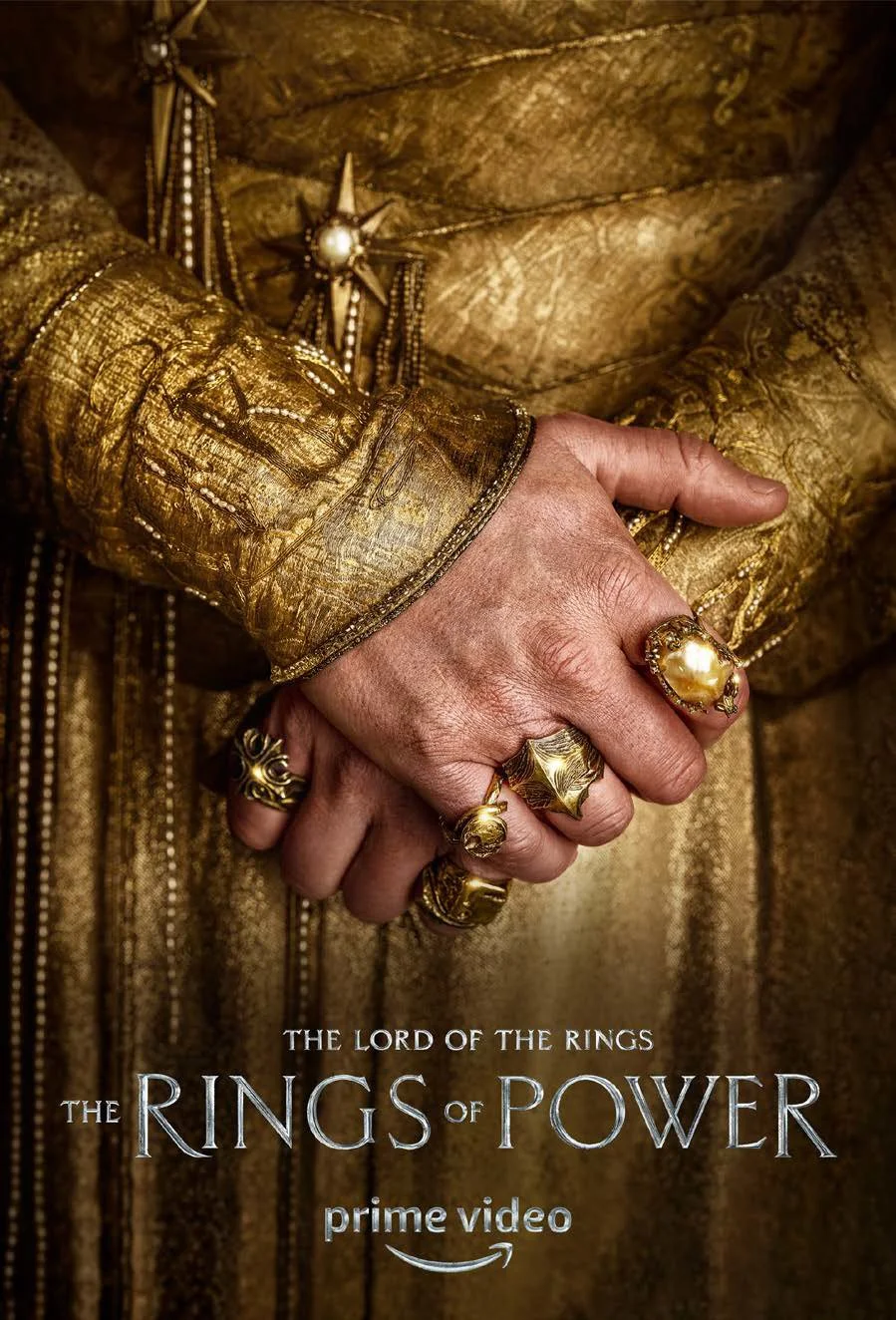
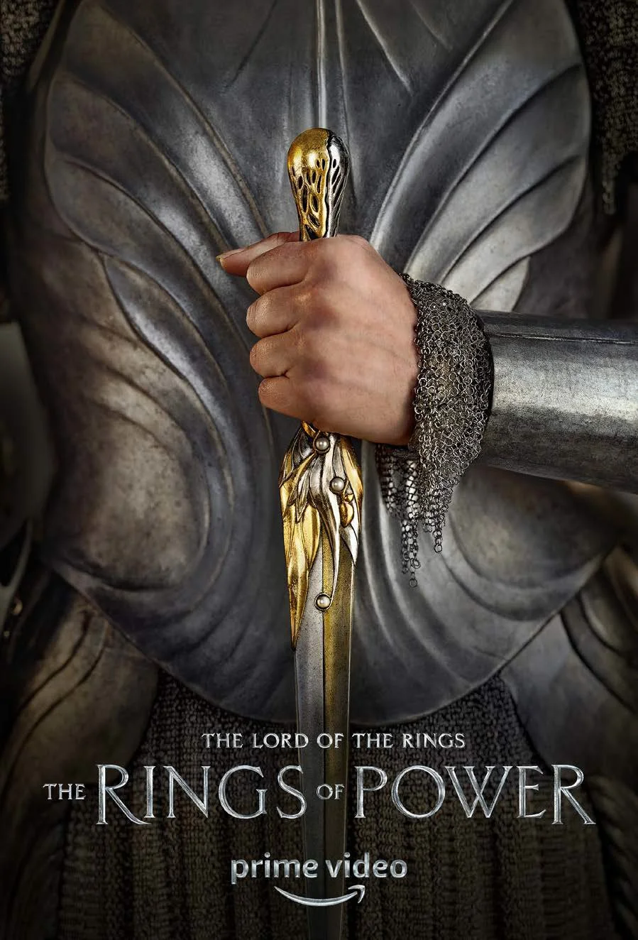
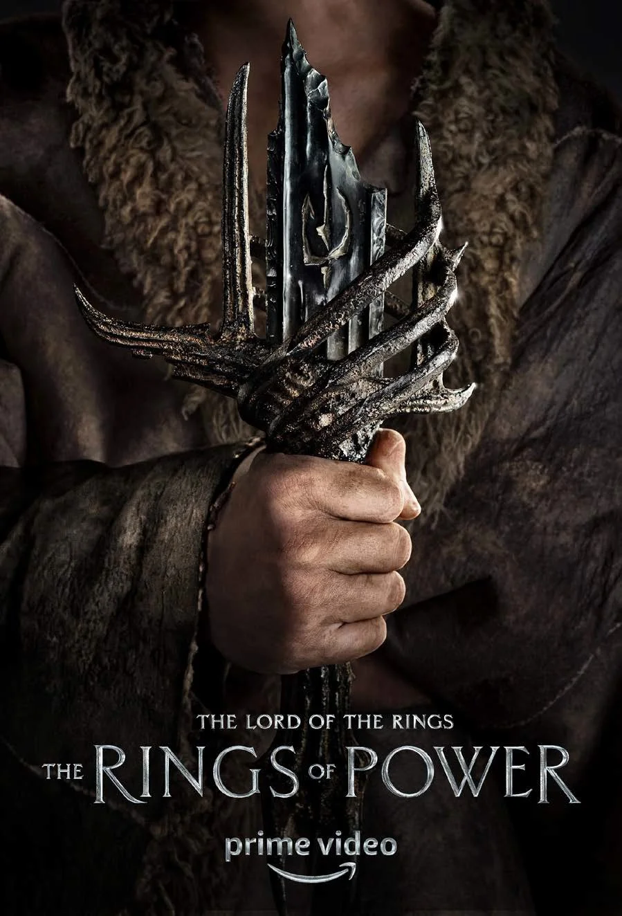
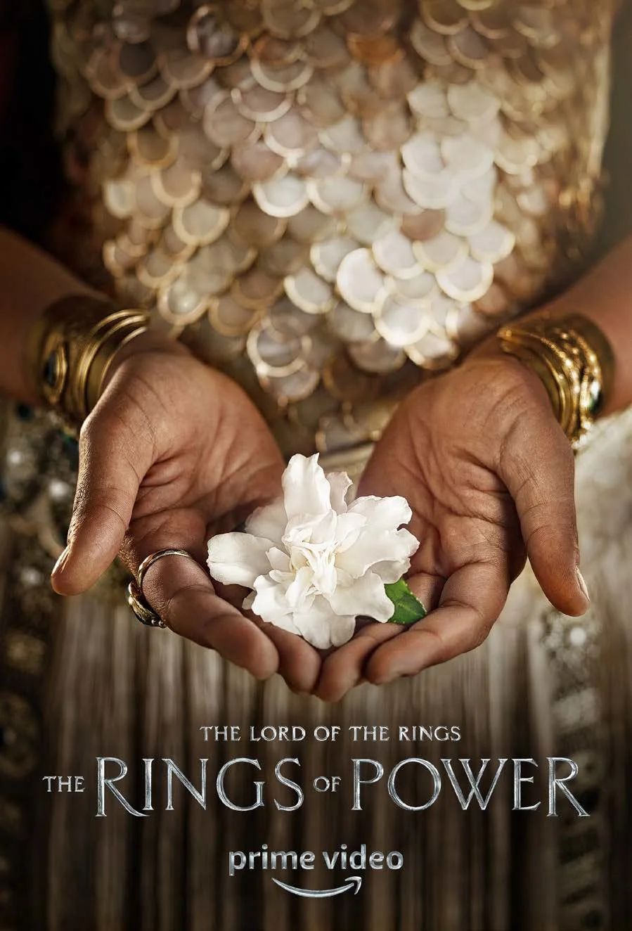
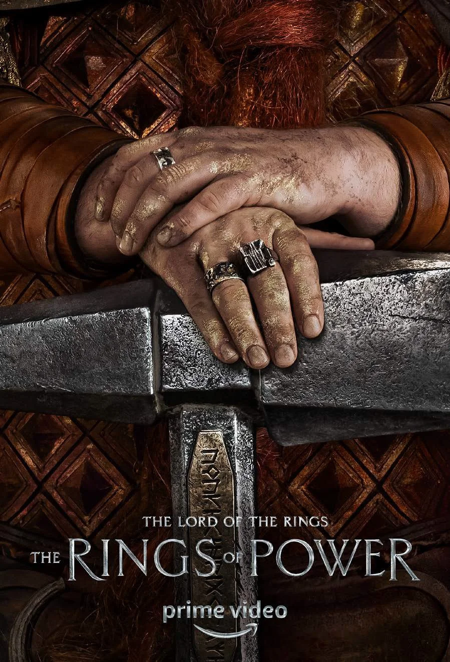
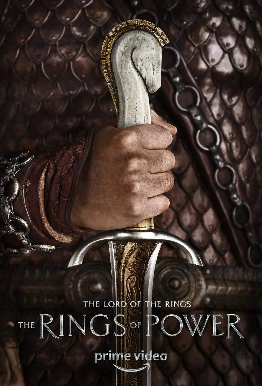
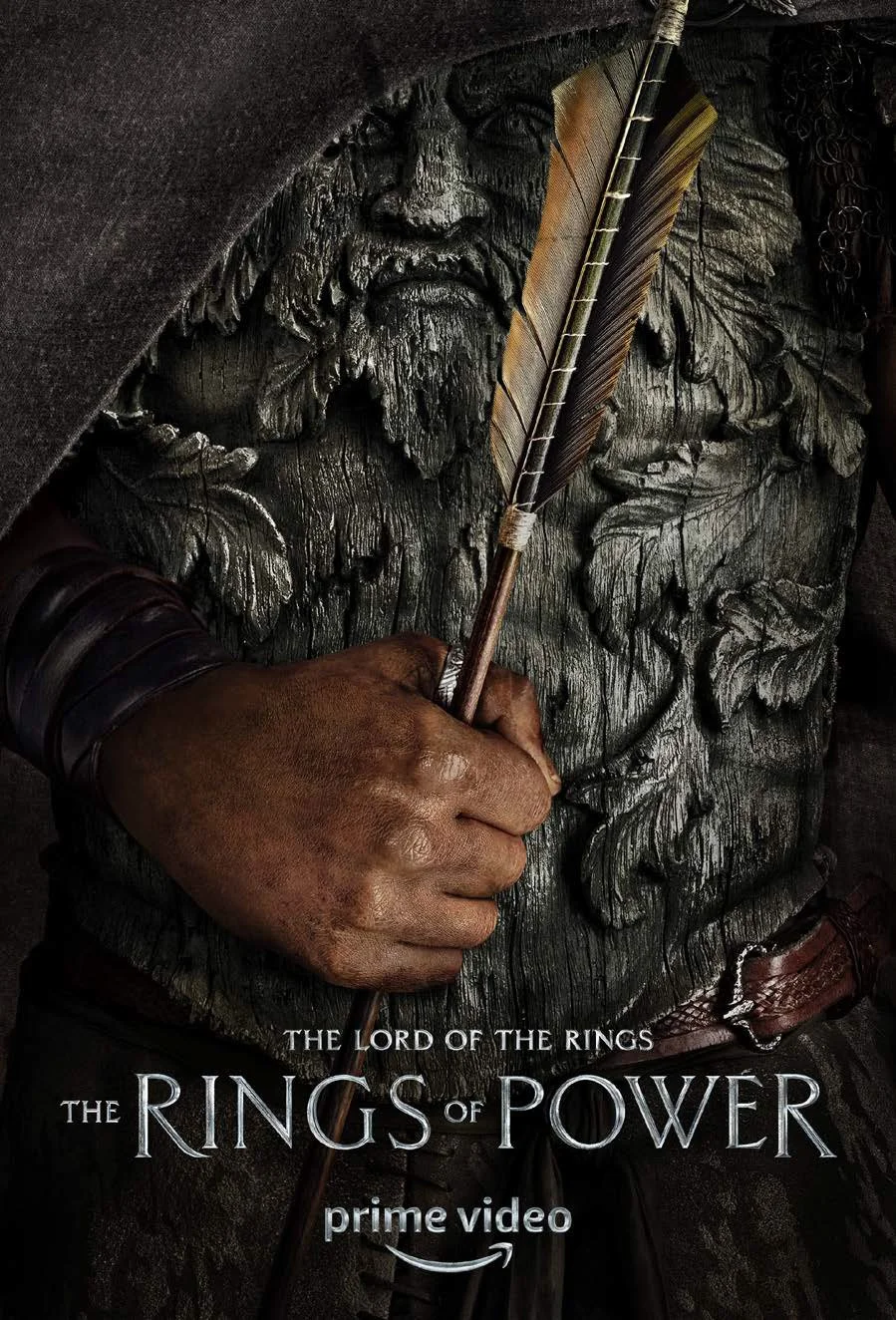
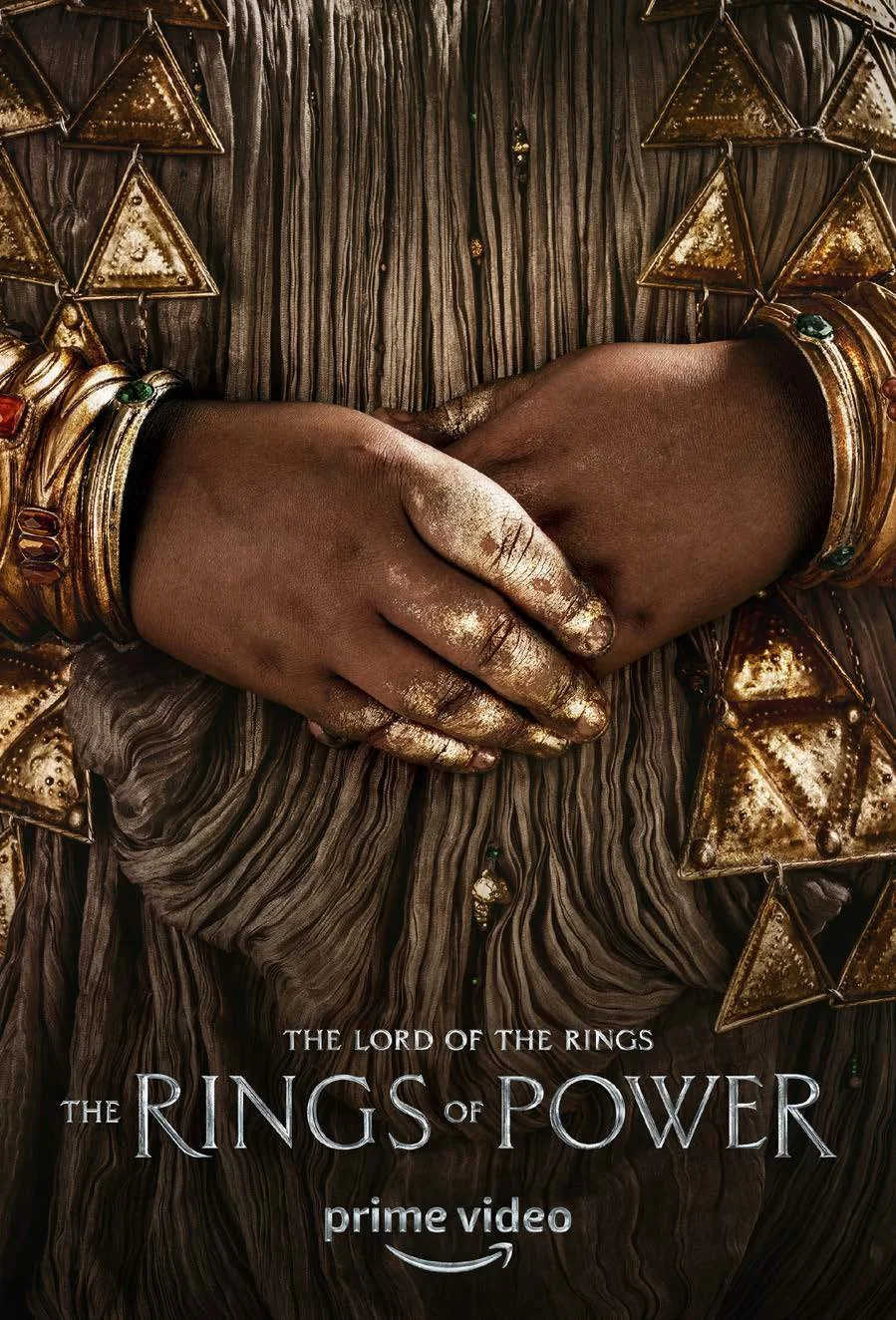
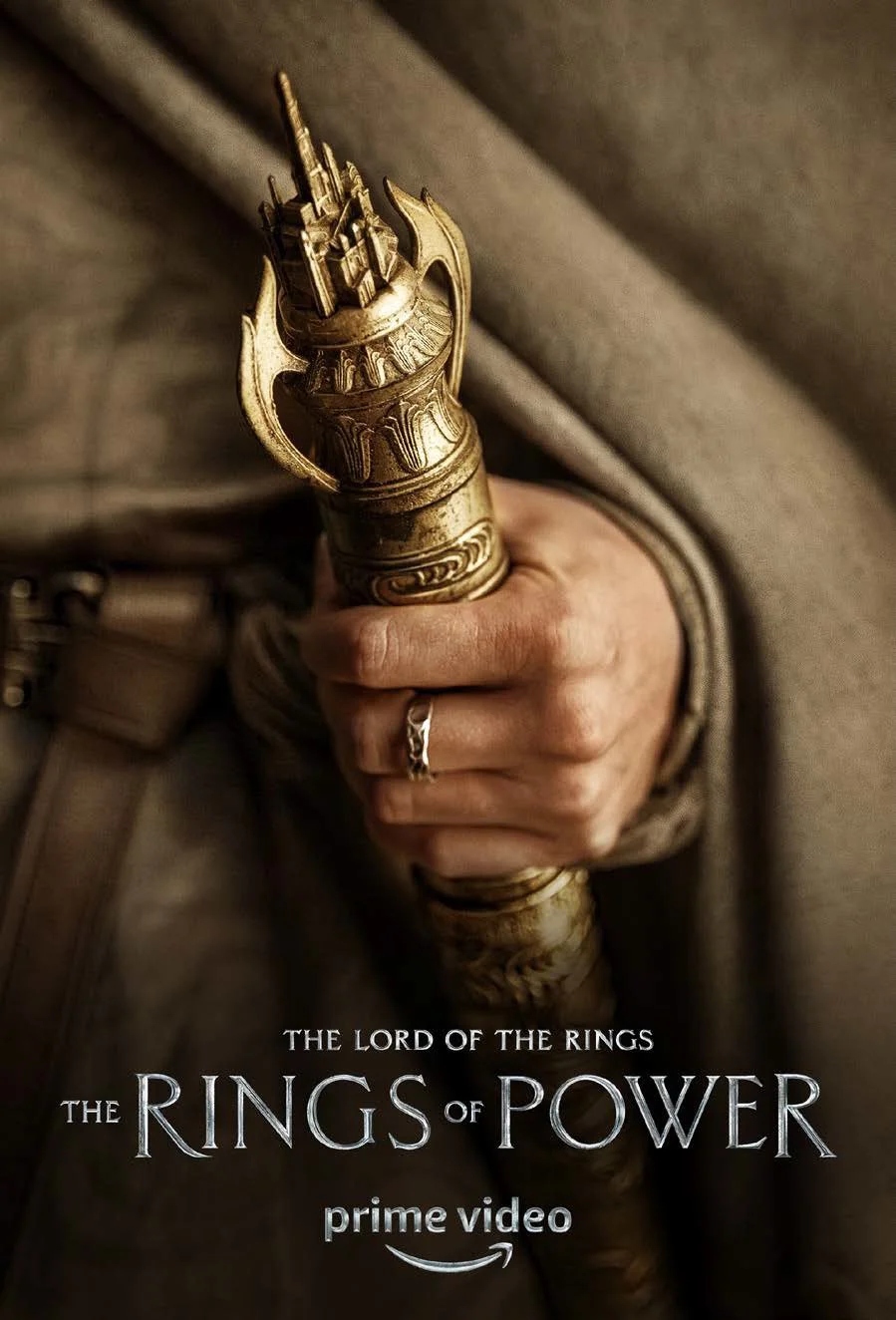
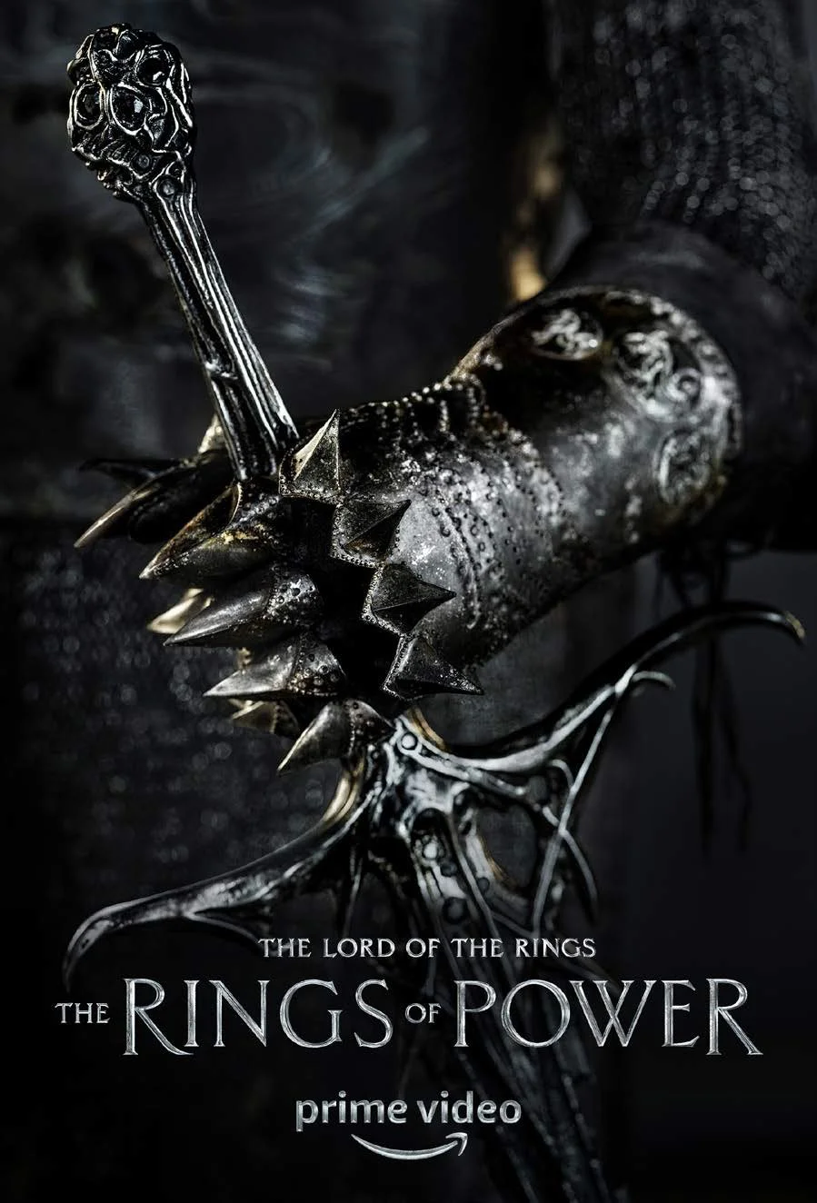
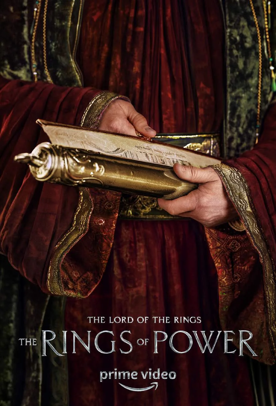
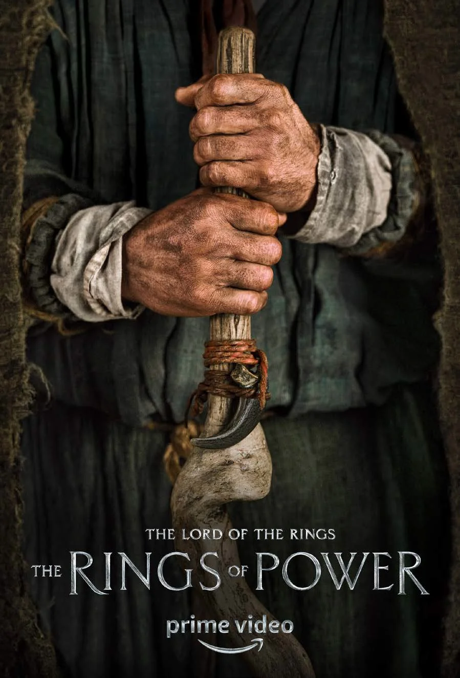
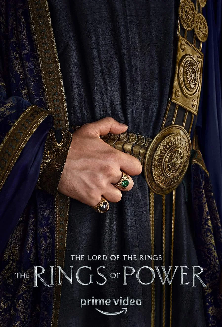
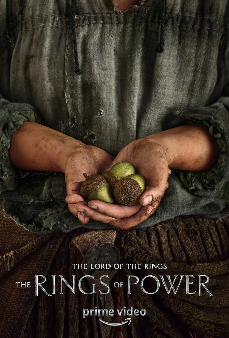
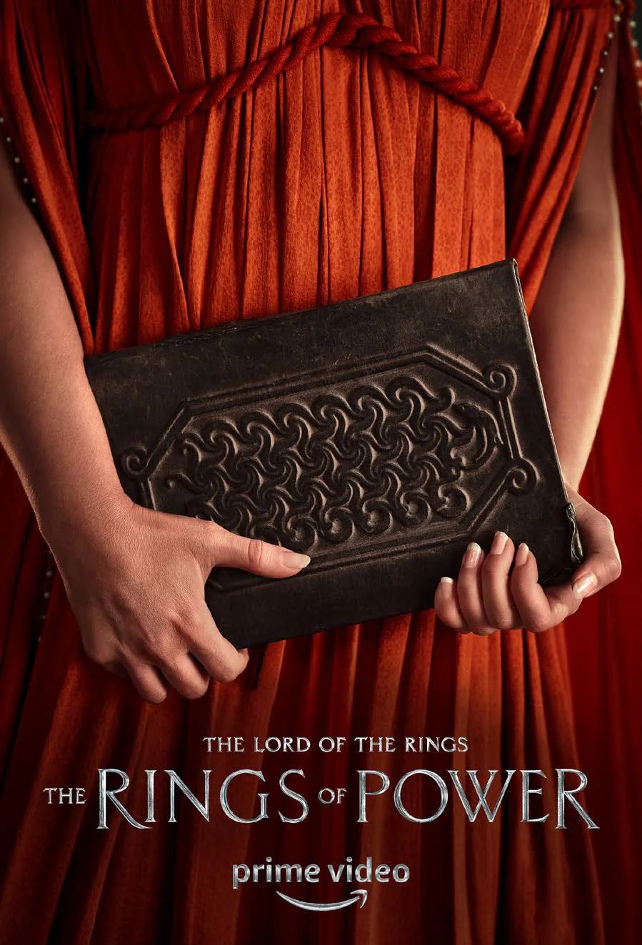
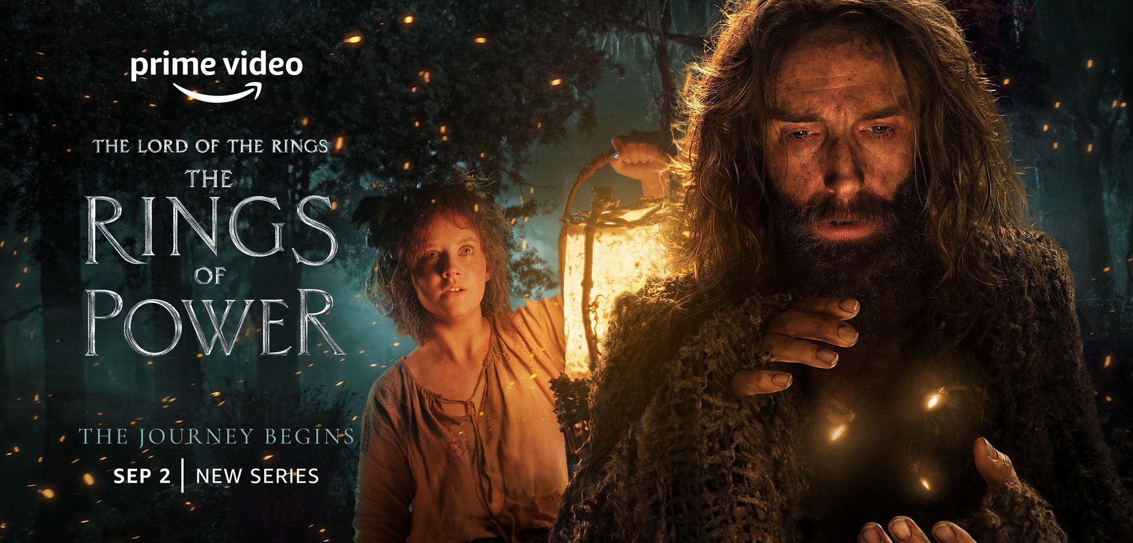
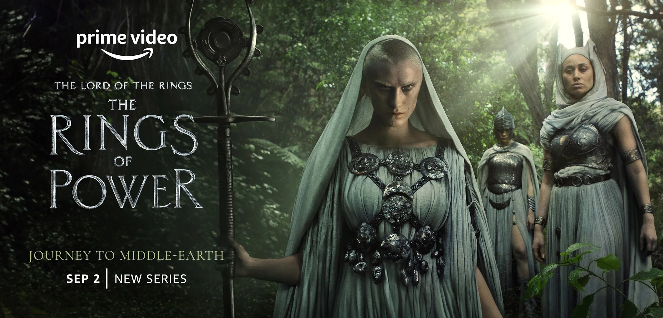
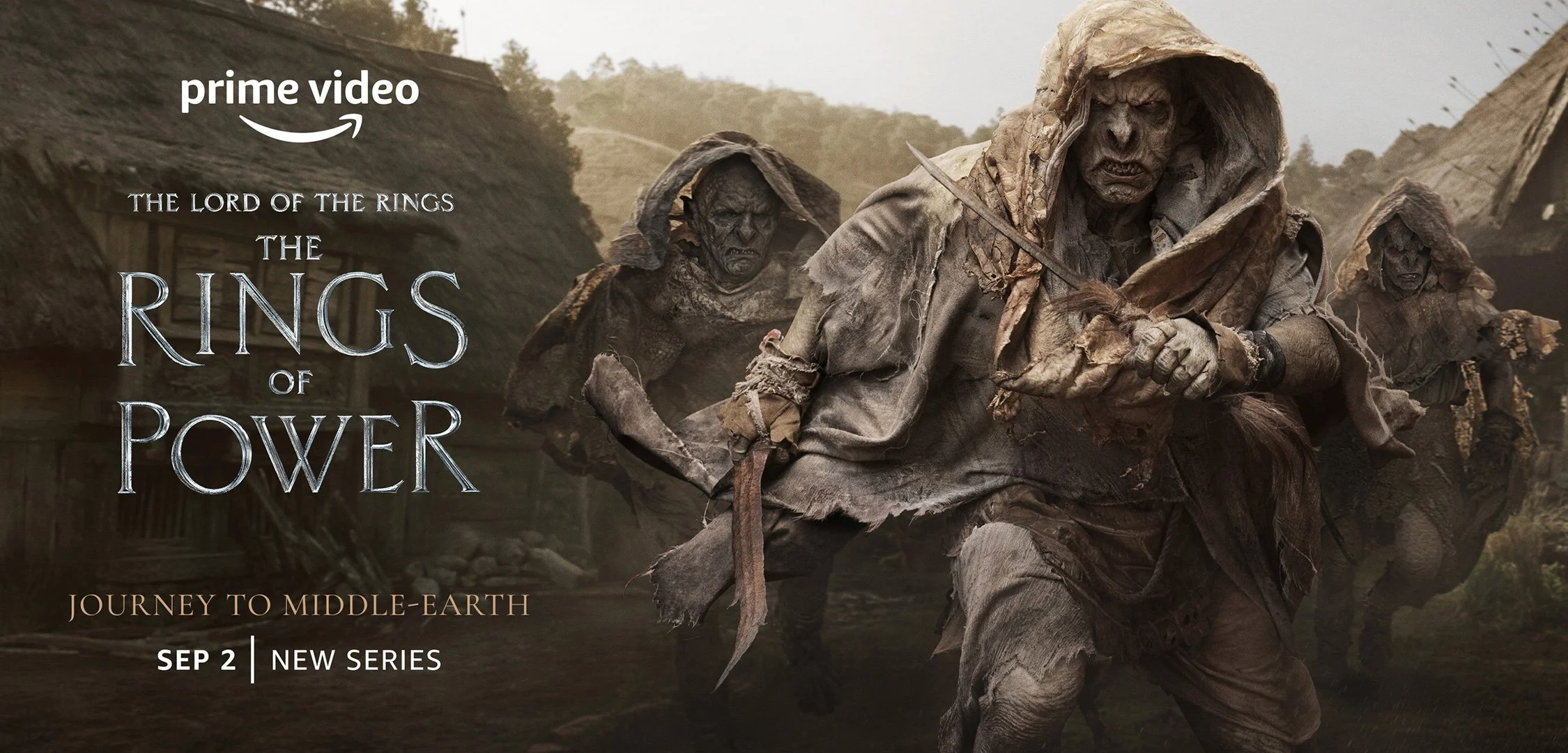
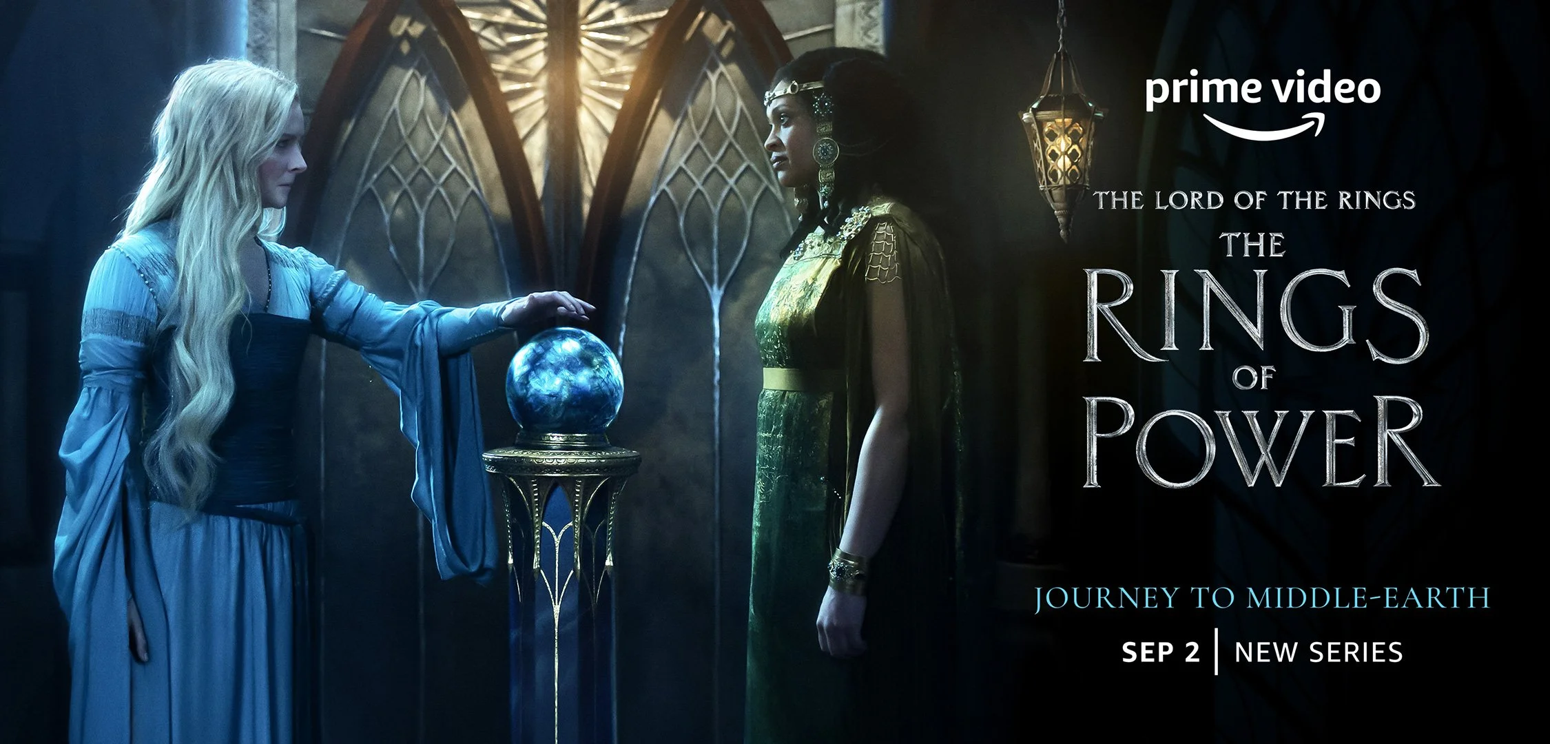
KEY ART: HAND SUITE
The character hand campaign was engineered from the start as a cultural moment. Each of the 23 character assets was distributed exclusively to individual influencer accounts simultaneously, revealing the world of Middle-earth through costume, texture, silhouette, and symbolism before audiences had seen a single face.
I art directed the full suite, overseeing an overseas on-set shoot remotely during COVID restrictions and leading an extensive finishing process to ensure every image met the level of craft the IP demanded. The deliberate restraint of the concept was designed to invite speculation and reward the obsessive attention of a deeply passionate fanbase.
Within 24 hours: over 627 million impressions, trending on Twitter in 8 countries, and more than 110,000 mentions online, all with no names, no descriptions, and no media support.
KEY ART
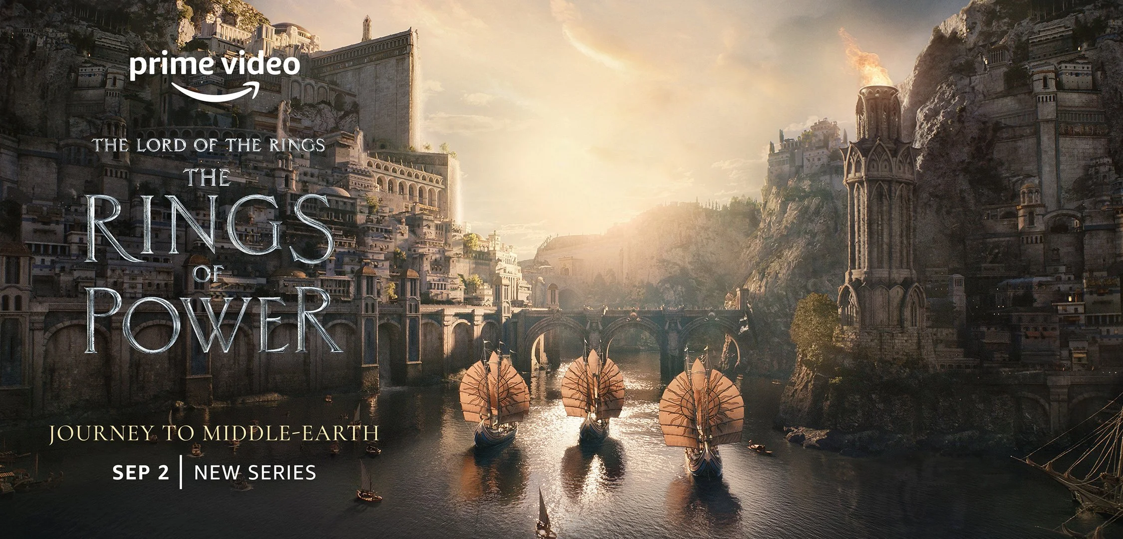
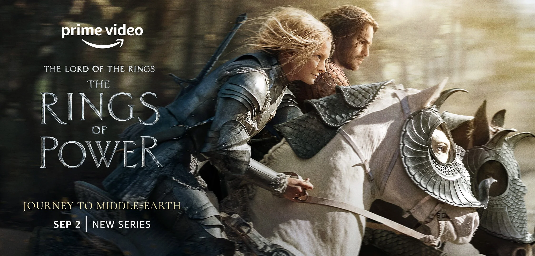
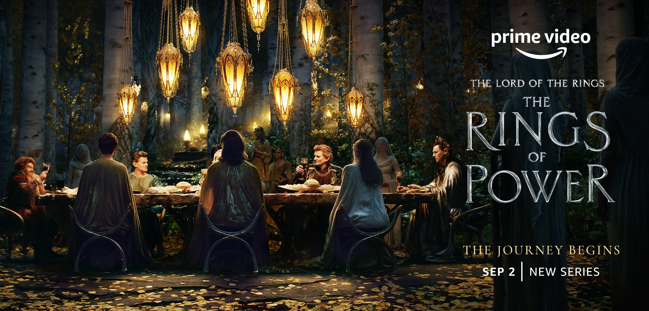
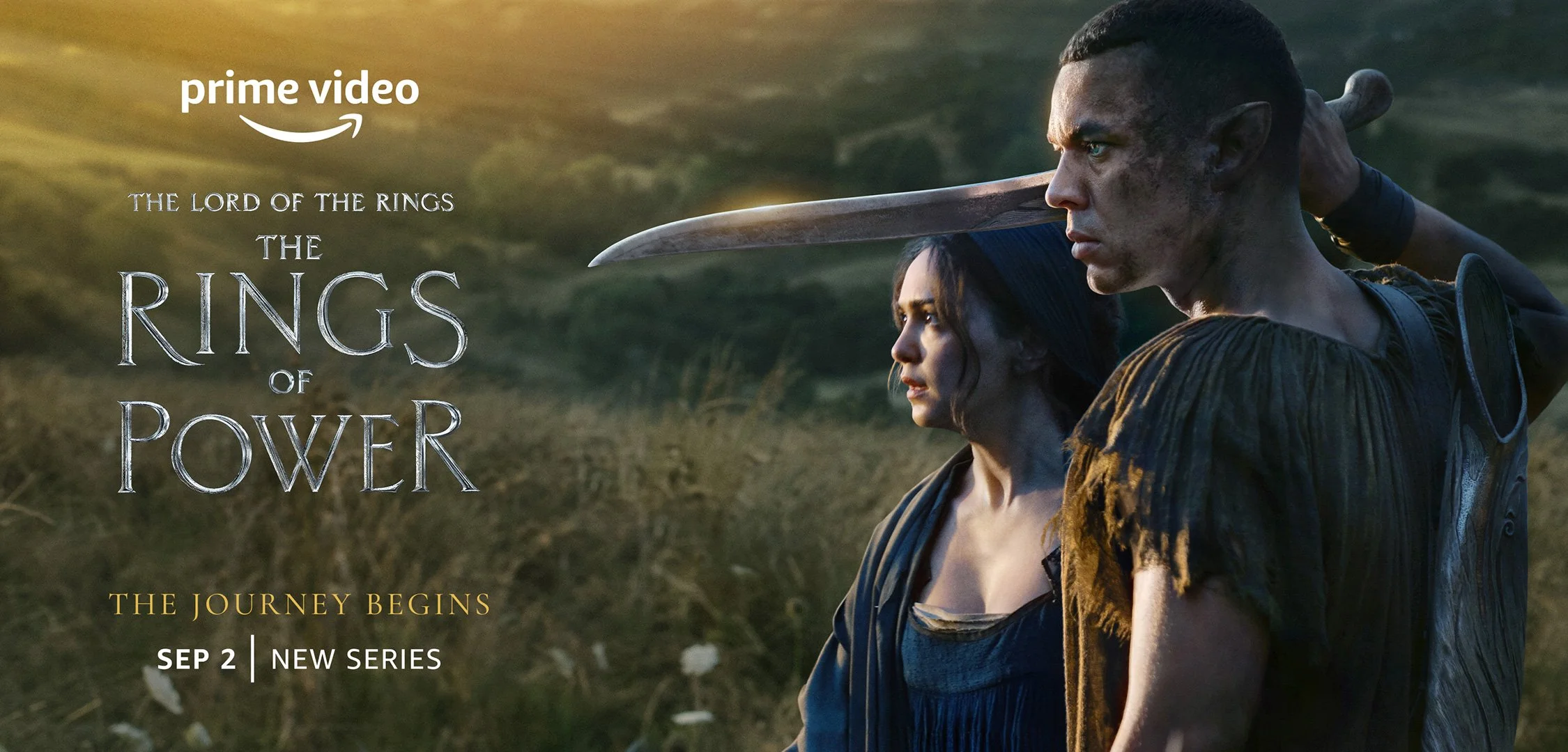
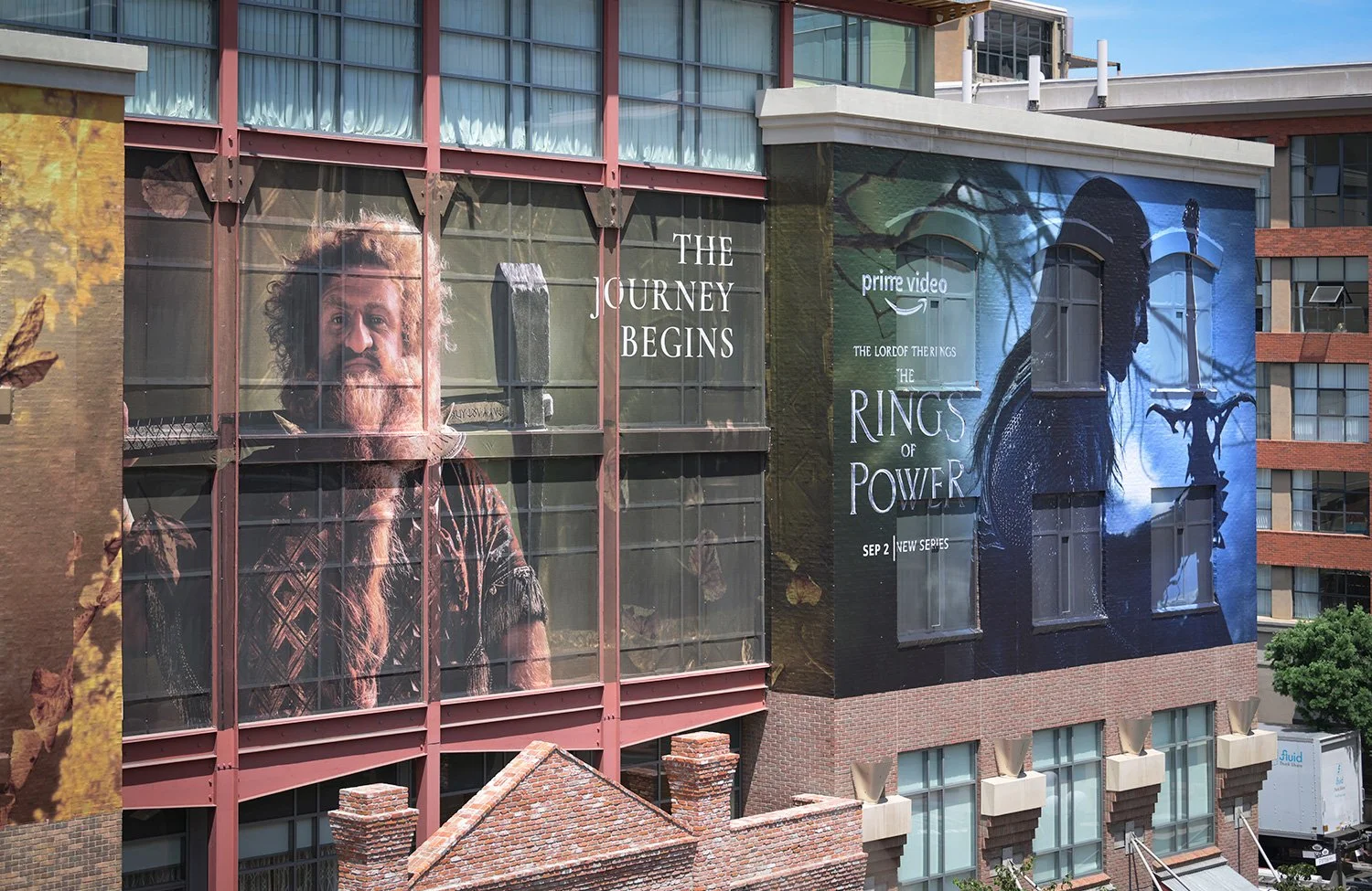
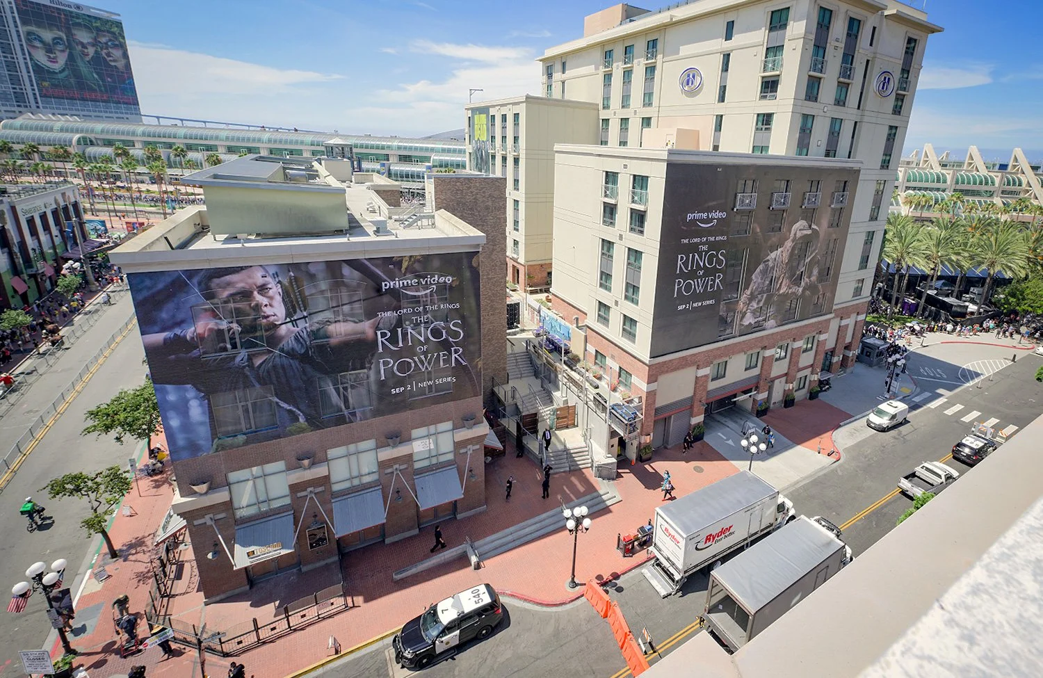
HIGH IMPACT OOH
The Lord of the Rings: The Rings of Power was a massive global campaign spanning OOH placements and high-visibility takeovers in more than 20 countries. Every placement had to carry the weight of the launch, building trust, raising excitement, and making the return to Middle-earth feel big, cinematic, and worthy of fans’ expectations.
I directed the regional executions across different markets, formats, and location-specific challenges, helping solve for unique placements while keeping the work premium, consistent, and impactful wherever it appeared..
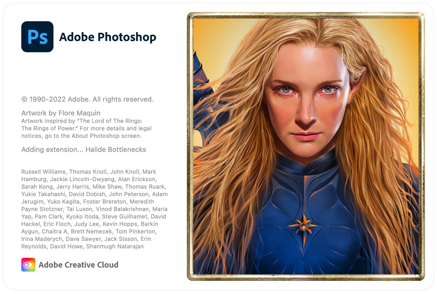
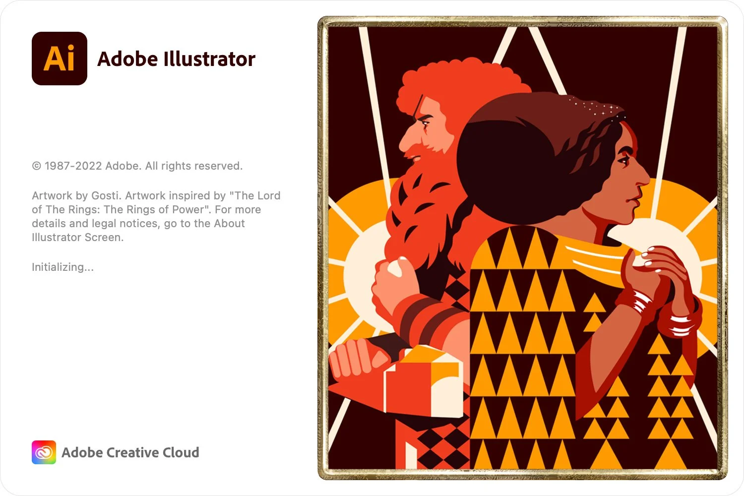
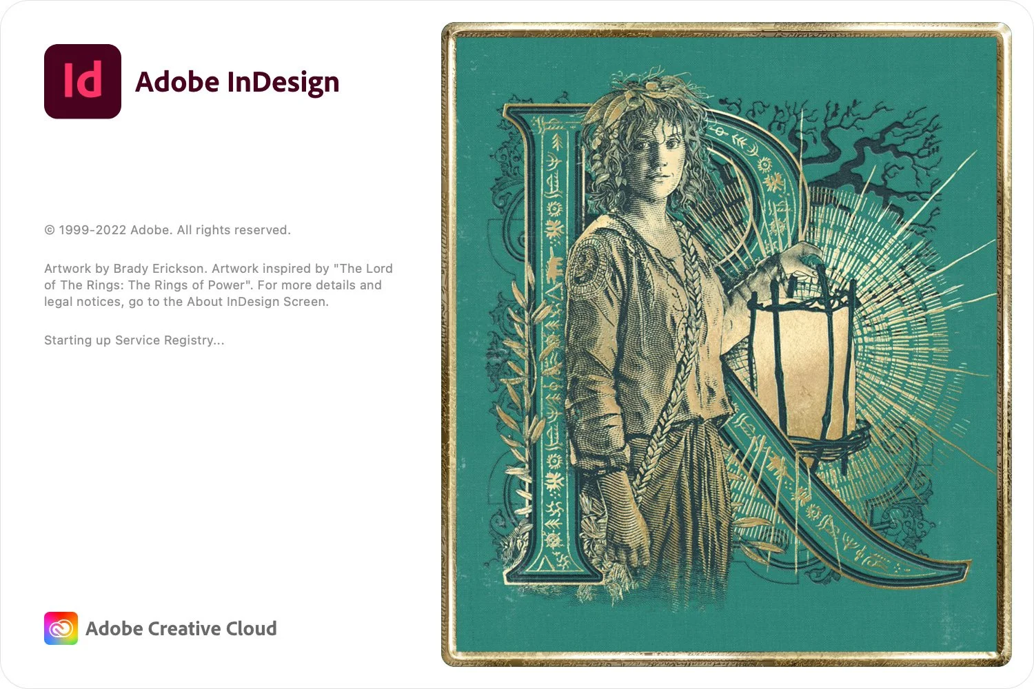
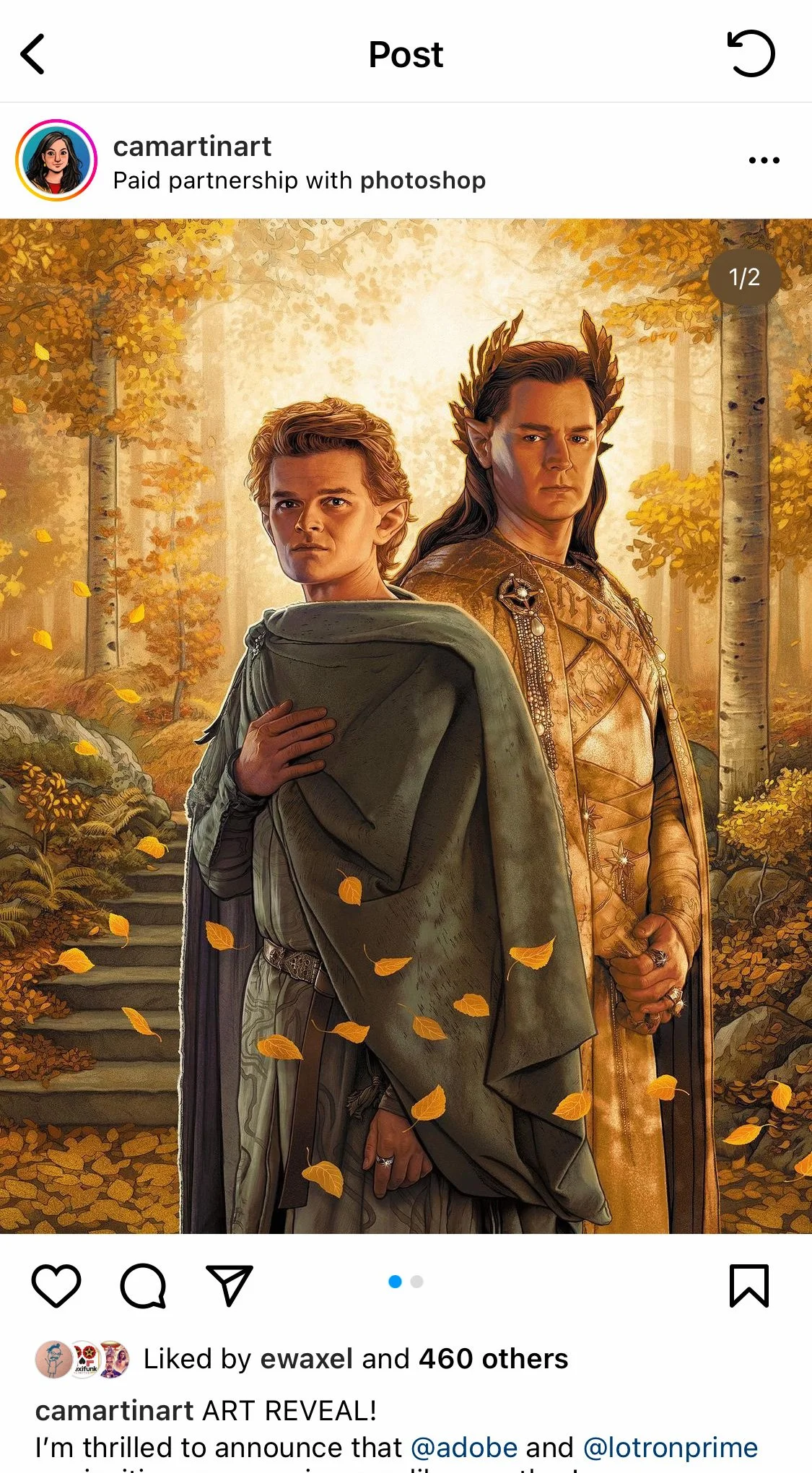
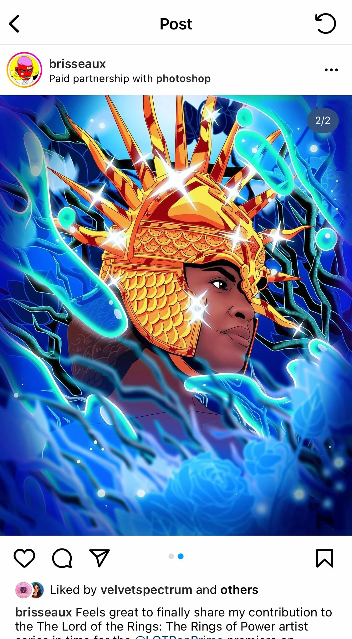
ADOBE PARTNERSHIP
The Rings of Power campaign reached beyond traditional marketing when Amazon partnered with Adobe to feature the campaign's visual identity across the splash screens of Photoshop, Illustrator, and InDesign — tools used by millions of creatives worldwide. It was a rare moment where entertainment marketing crossed into creative culture, putting the world of Middle-earth in front of designers every time they opened their tools.
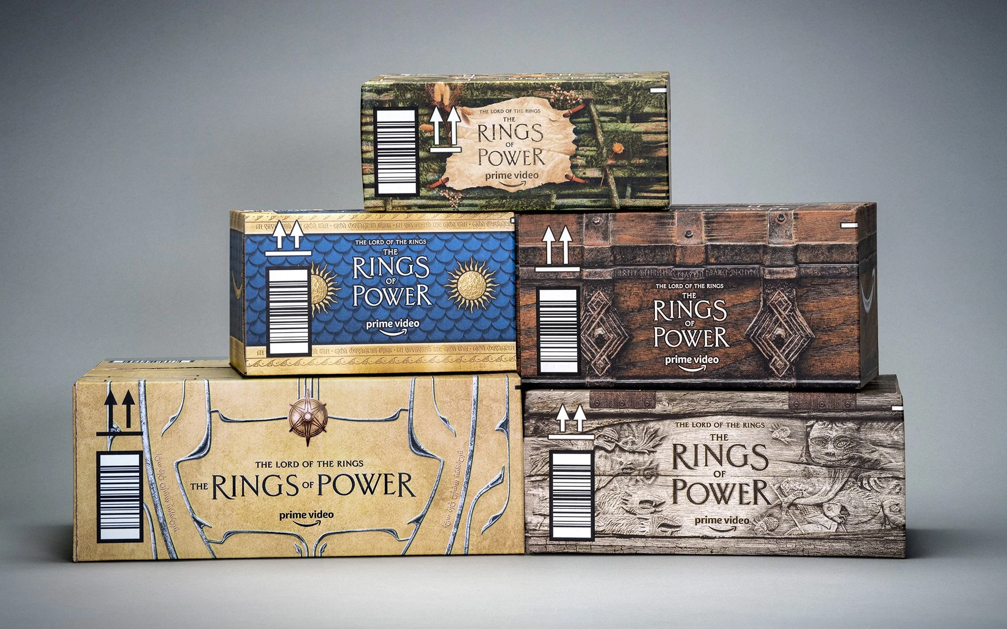
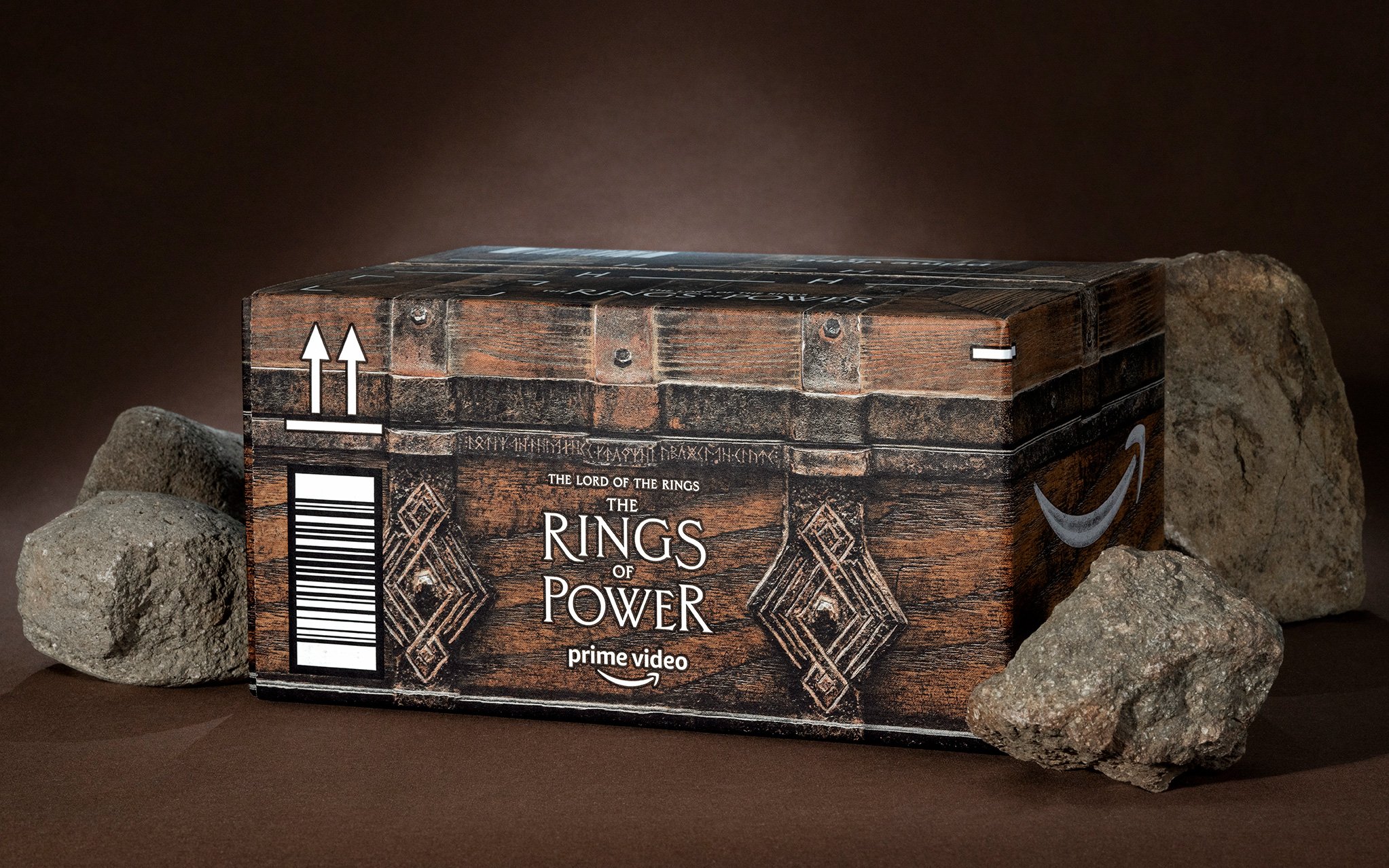
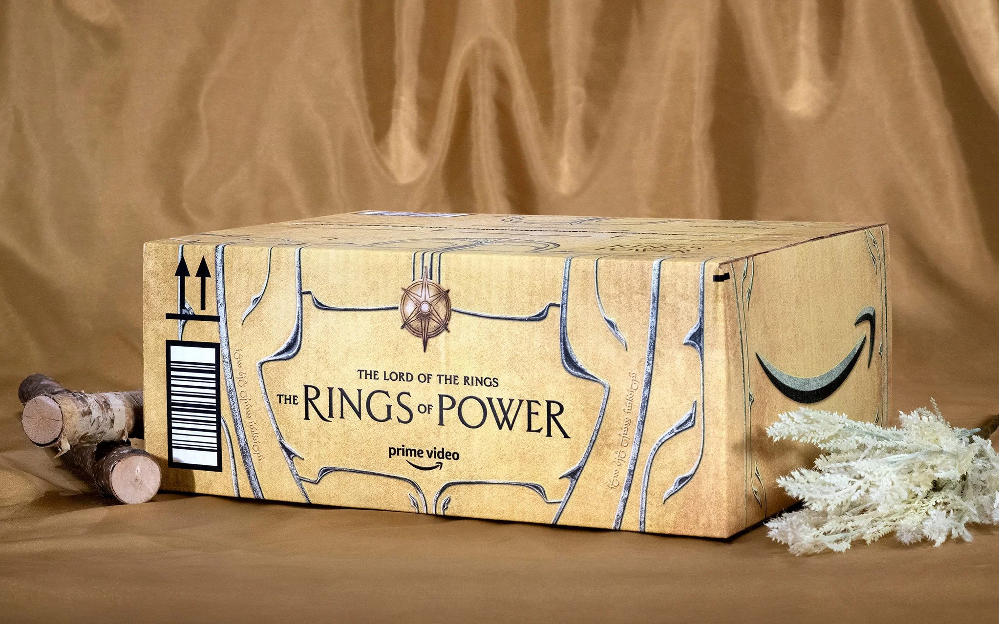
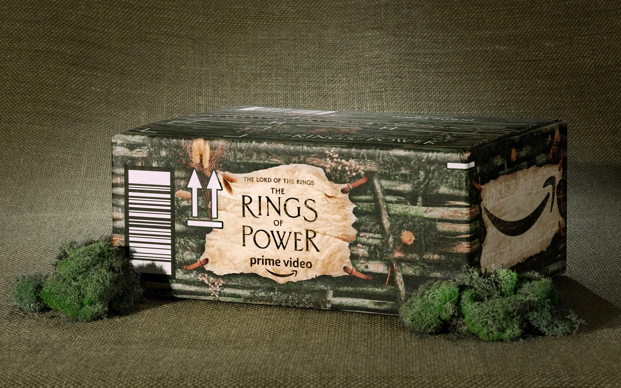
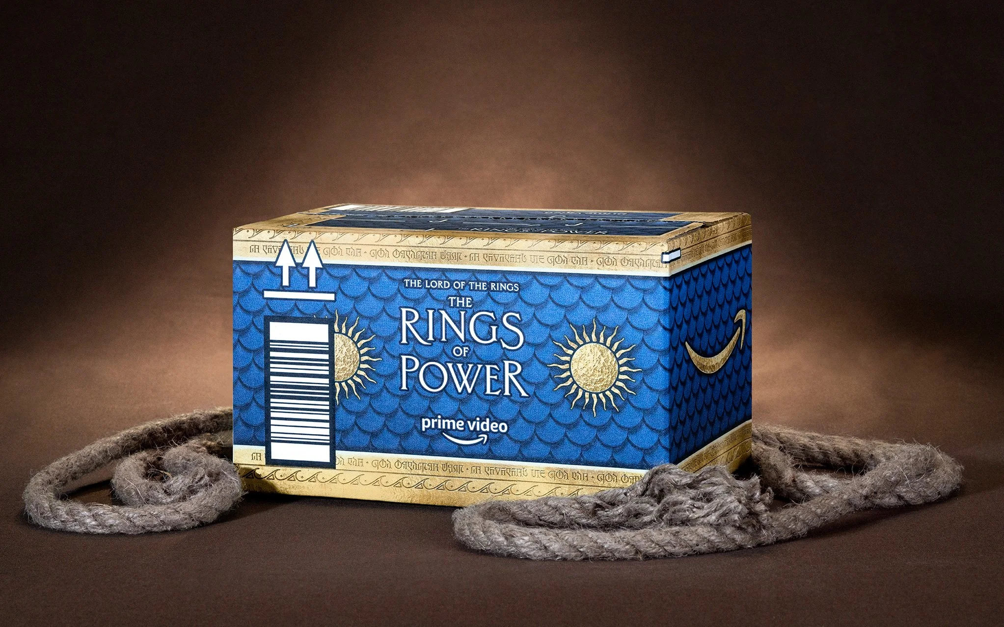
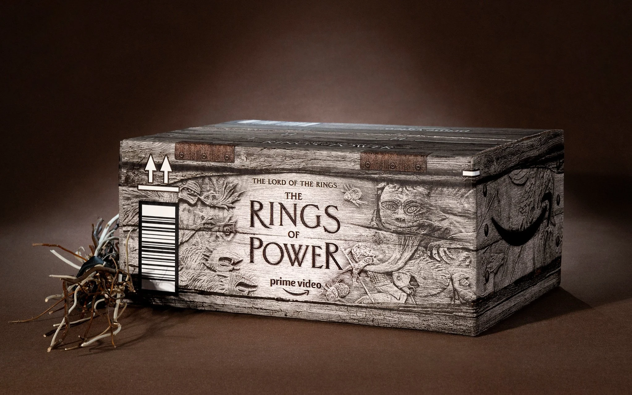
AMAZON BOXES
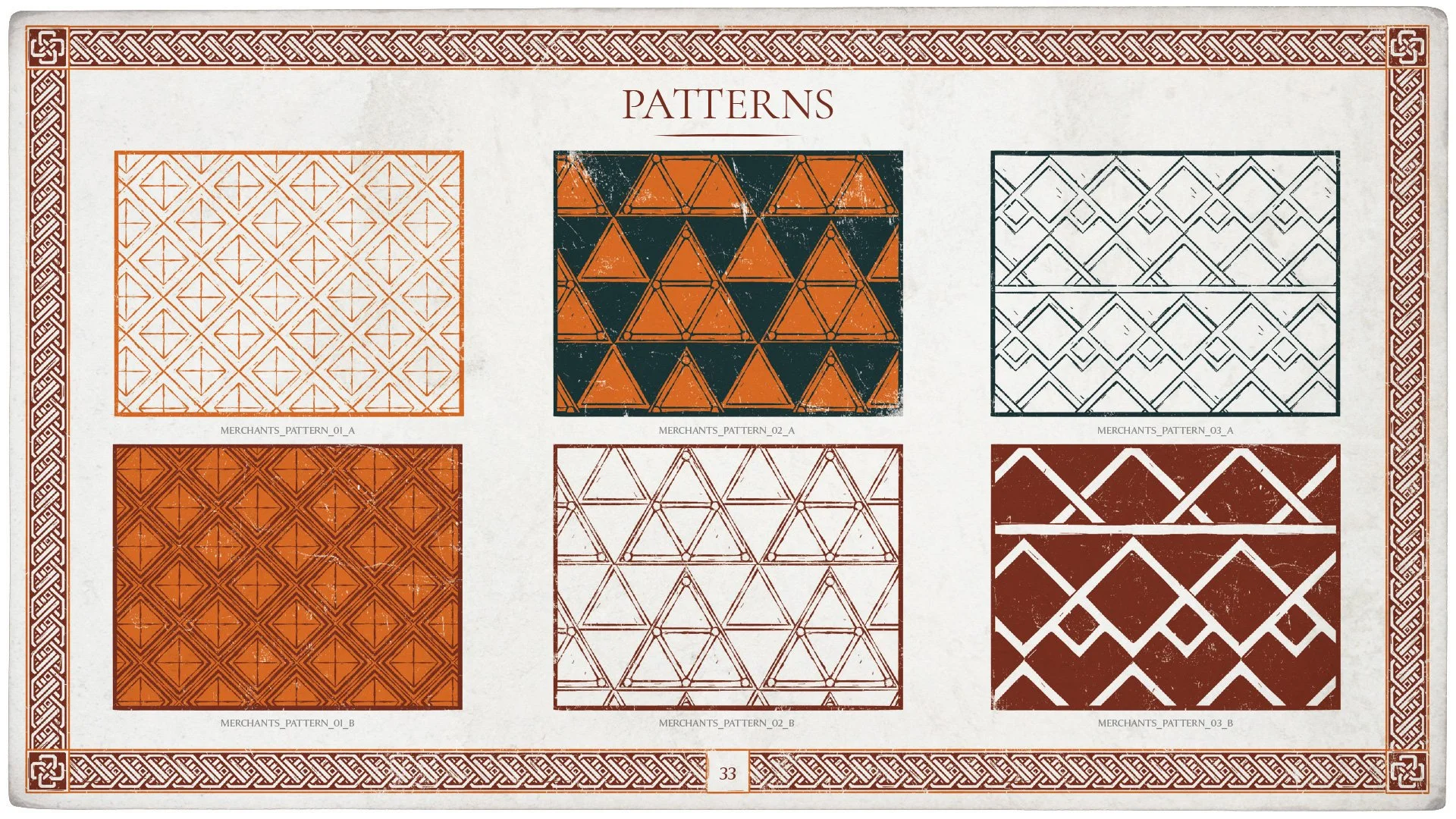
Custom Amazon packaging became another opportunity to extend the world-building of the campaign into physical fan touchpoints. Each box design drew on different cultures, and motifs from Middle-earth, translating those identities across a wide range of packaging formats and production constraints. In several cases, limited existing reference material meant developing new visual directions that still felt authentic to the world of the series.
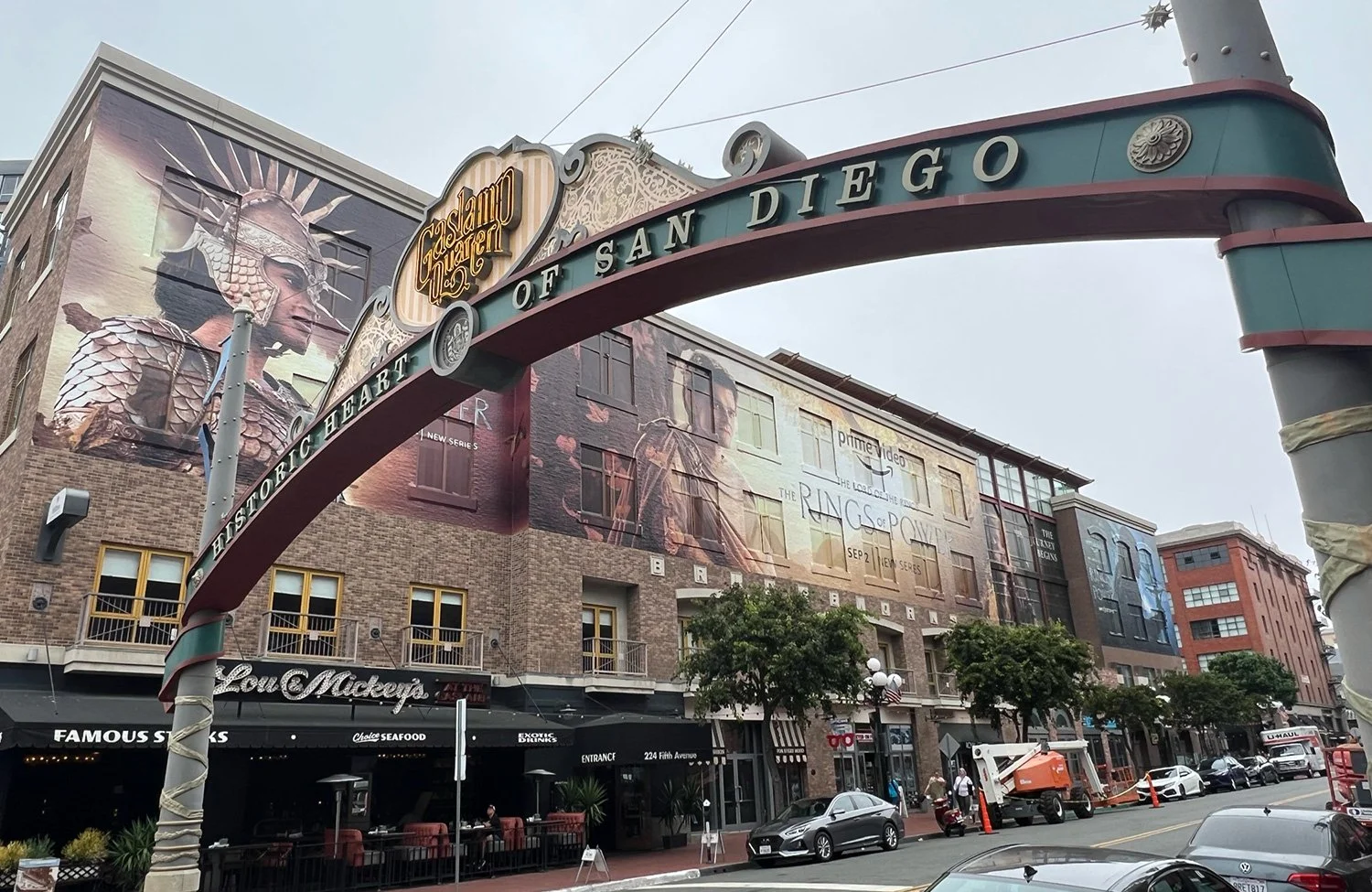
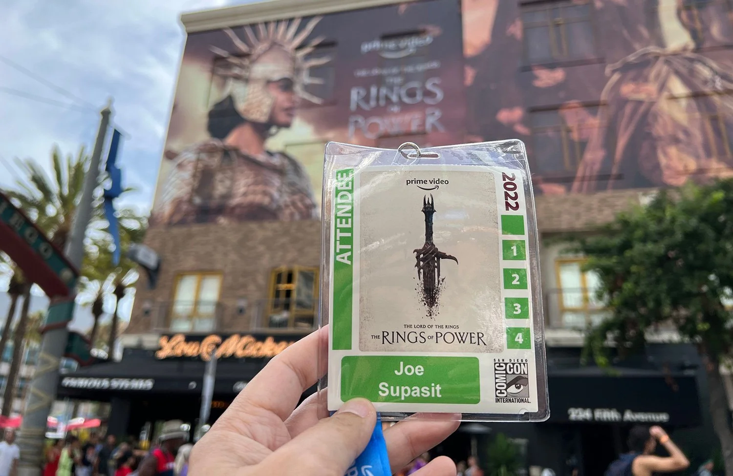
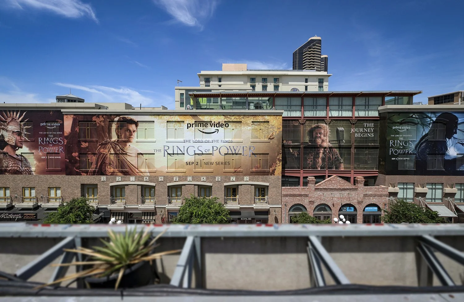
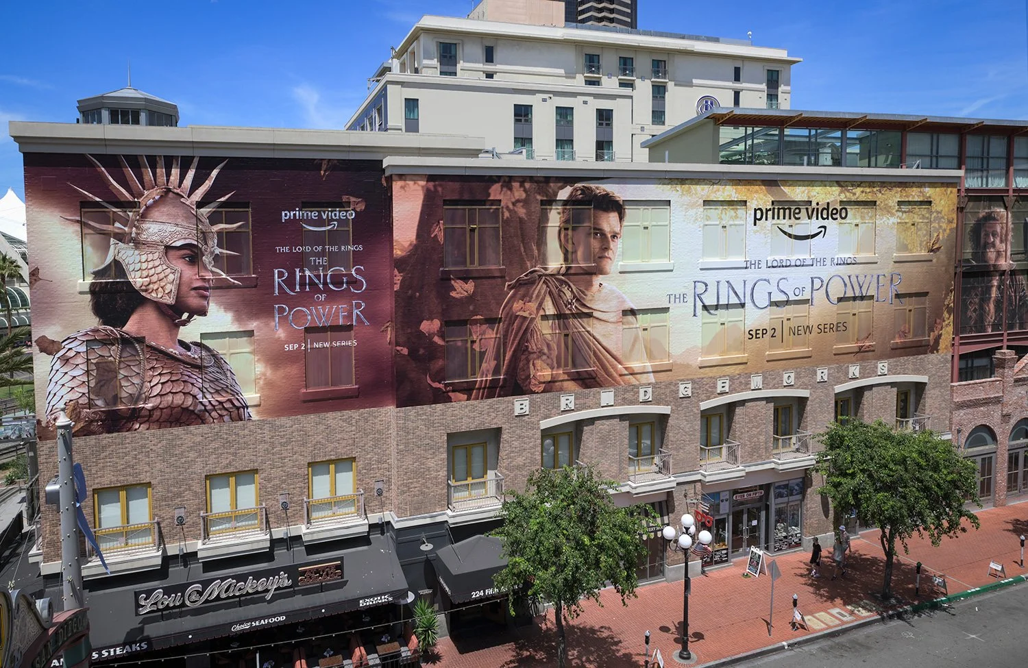
SAN DIEGO COMIC-CON
San Diego Comic-Con was the moment the campaign finally met the fans face to face. After months of building anticipation, the work needed to feel cinematic, crafted, and worthy of Middle-earth to earn more trust and excitement from the people who cared the most.
Seeing the title treatment and campaign world show up across Hall H’s giant screens, exterior placements, and the surrounding experience reinforced why every detail mattered. What mattered was knowing the ideas, craftsmanship, and care we poured into the campaign were there.
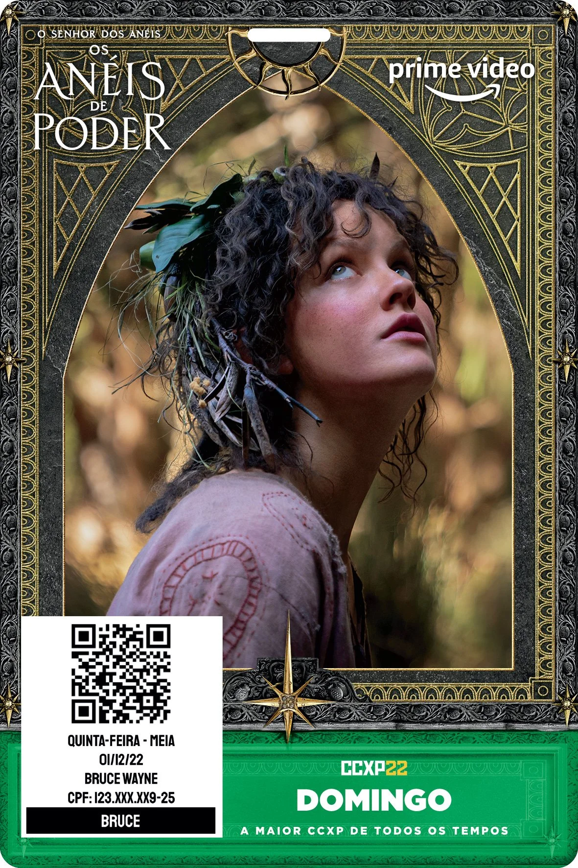
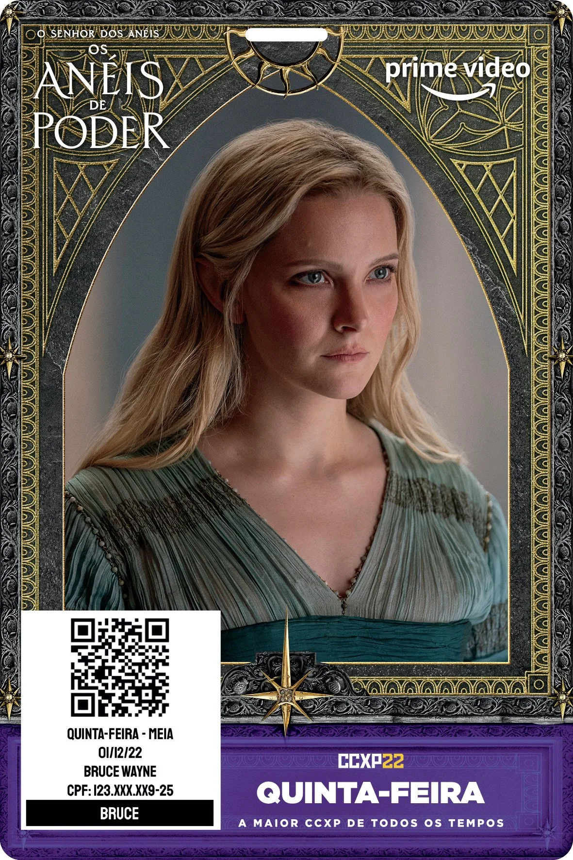
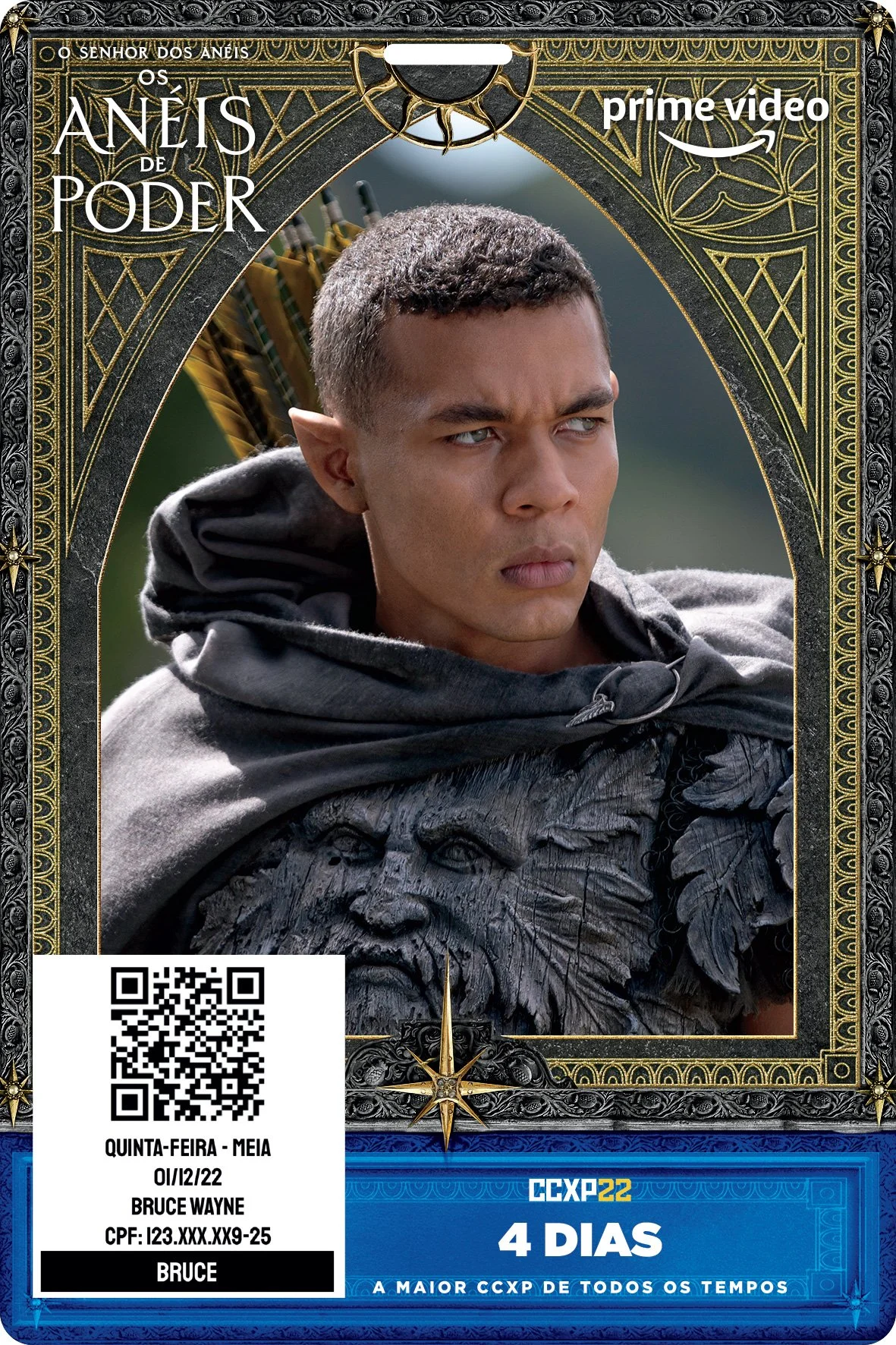
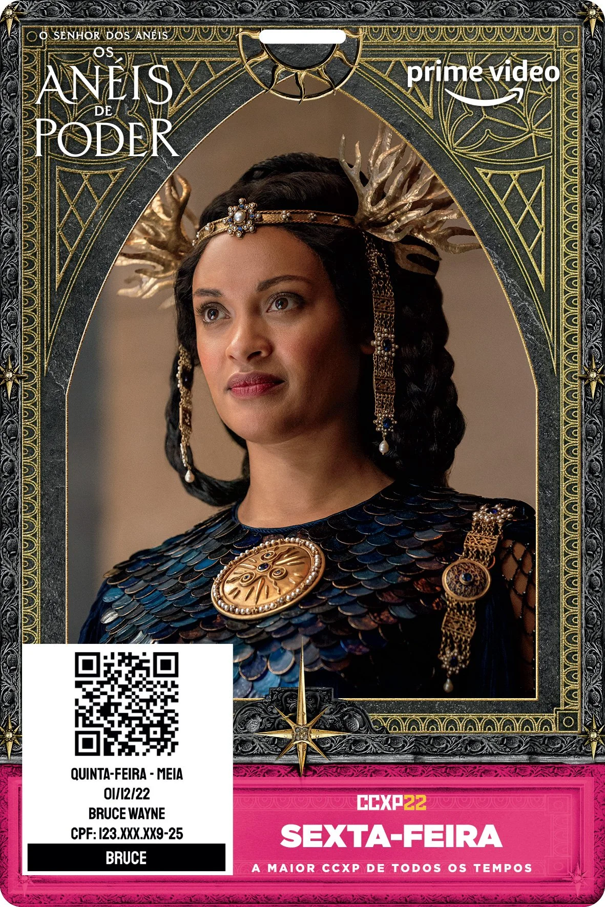
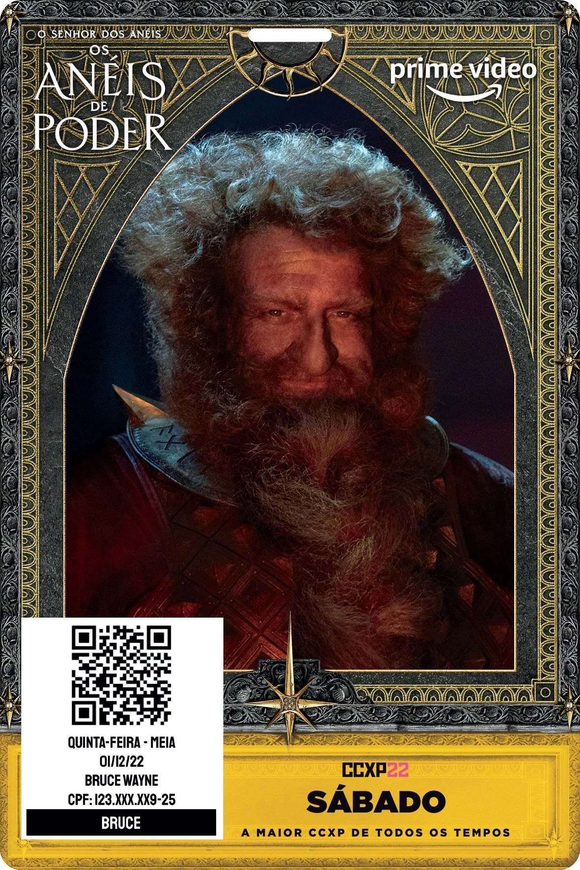
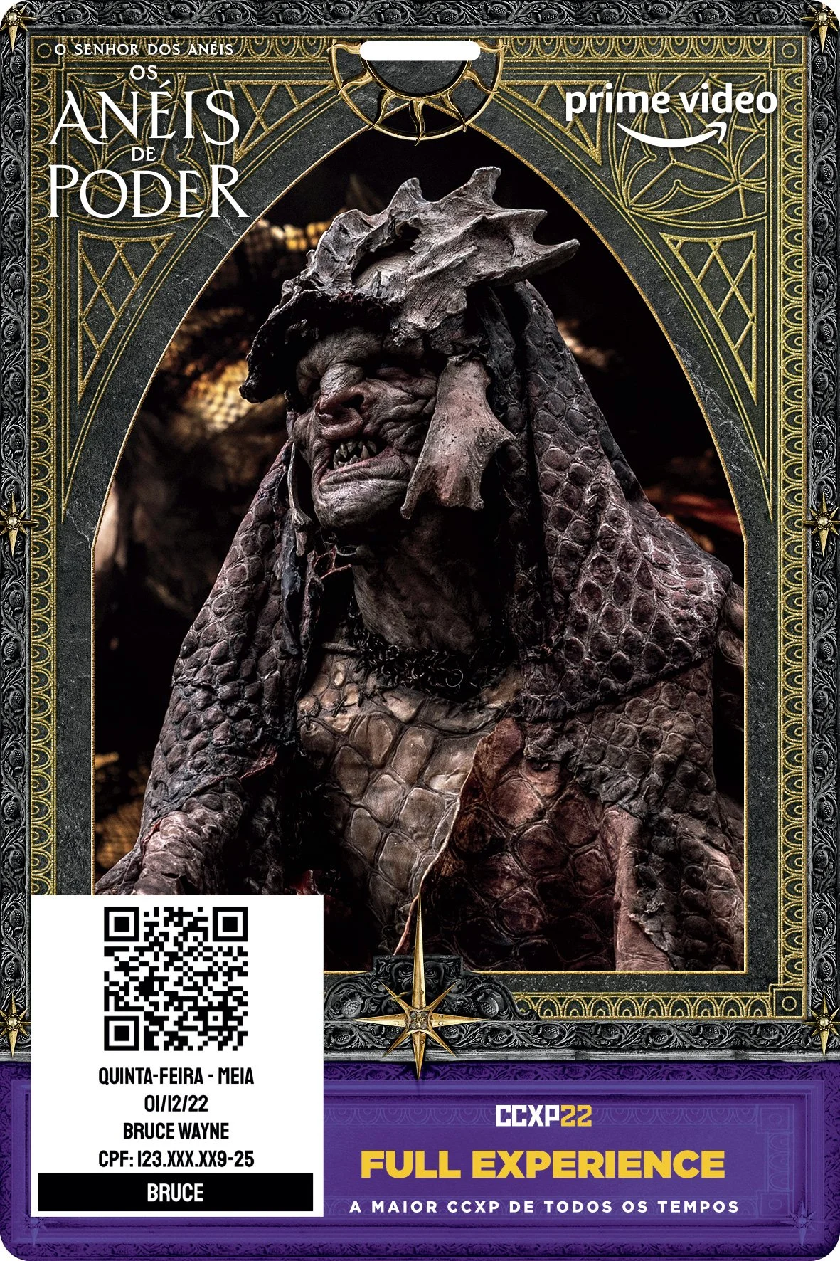
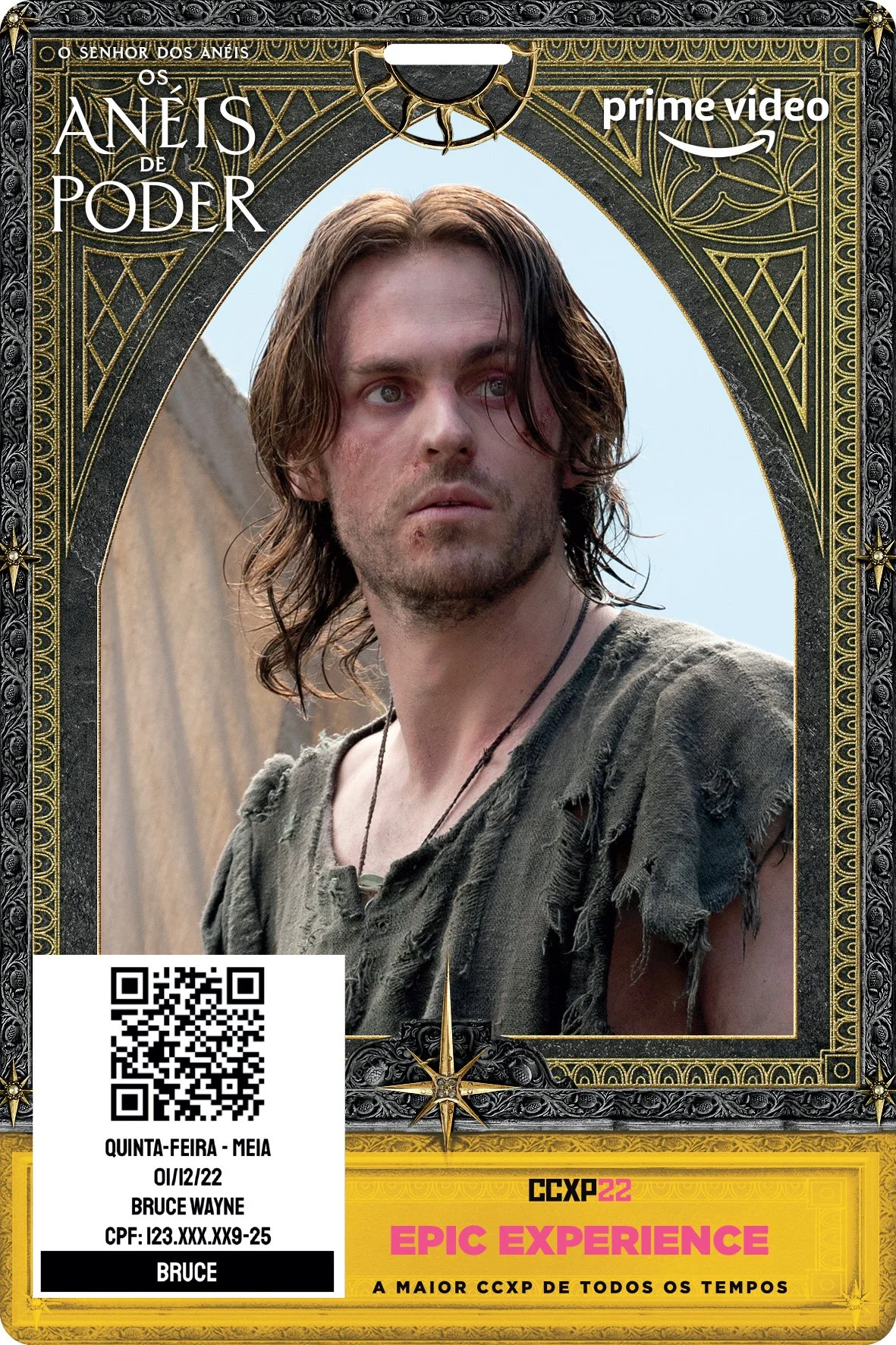
CCXP EVENT BADGES
Designed collectible event badges for CCXP, one of the largest pop culture conventions in Brazil, as part of the global campaign rollout.
DIGITAL ADVERTISING
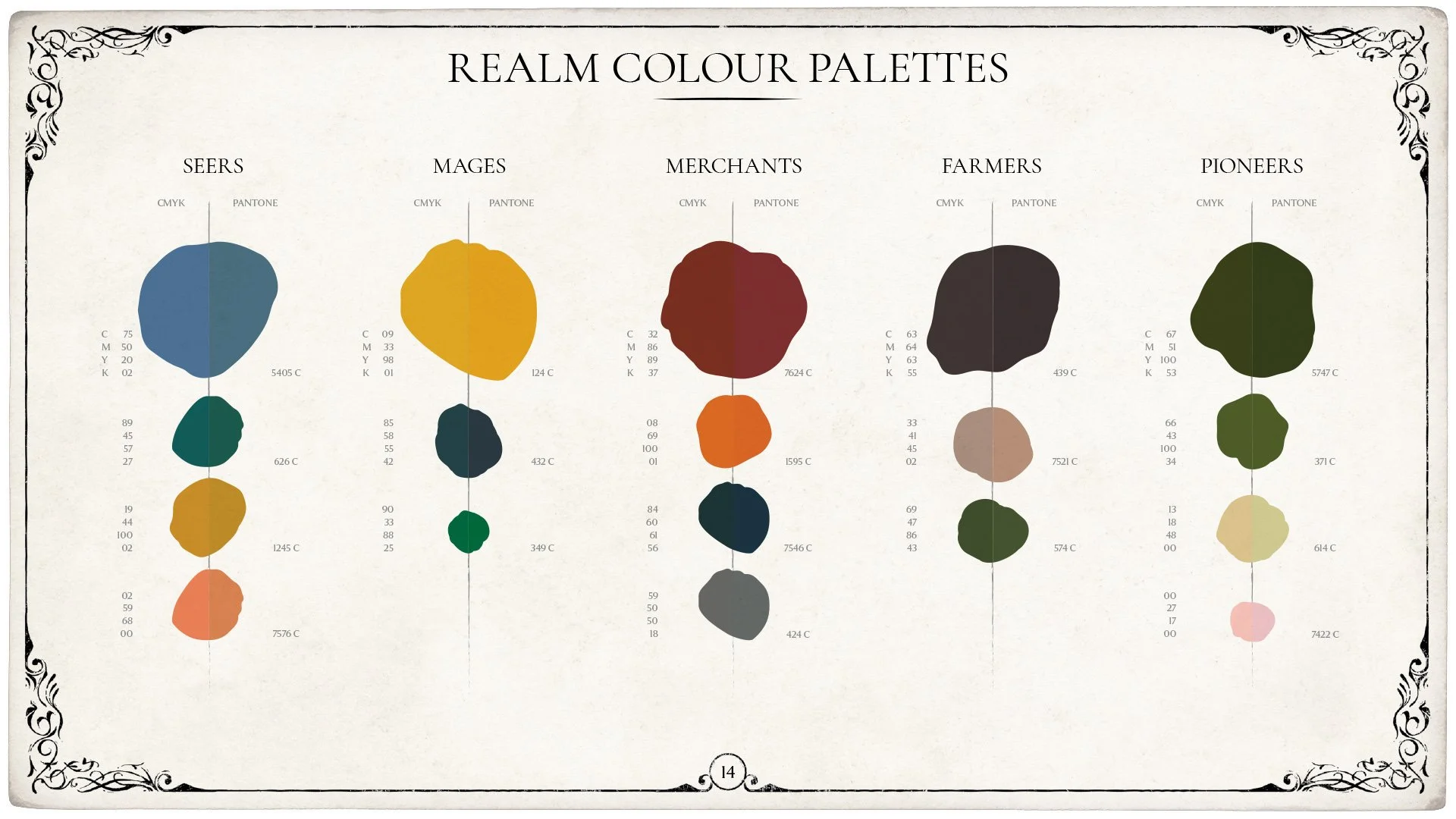
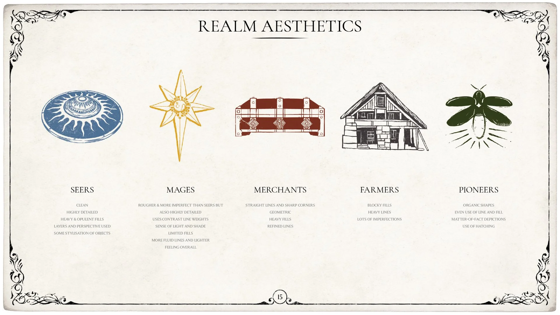
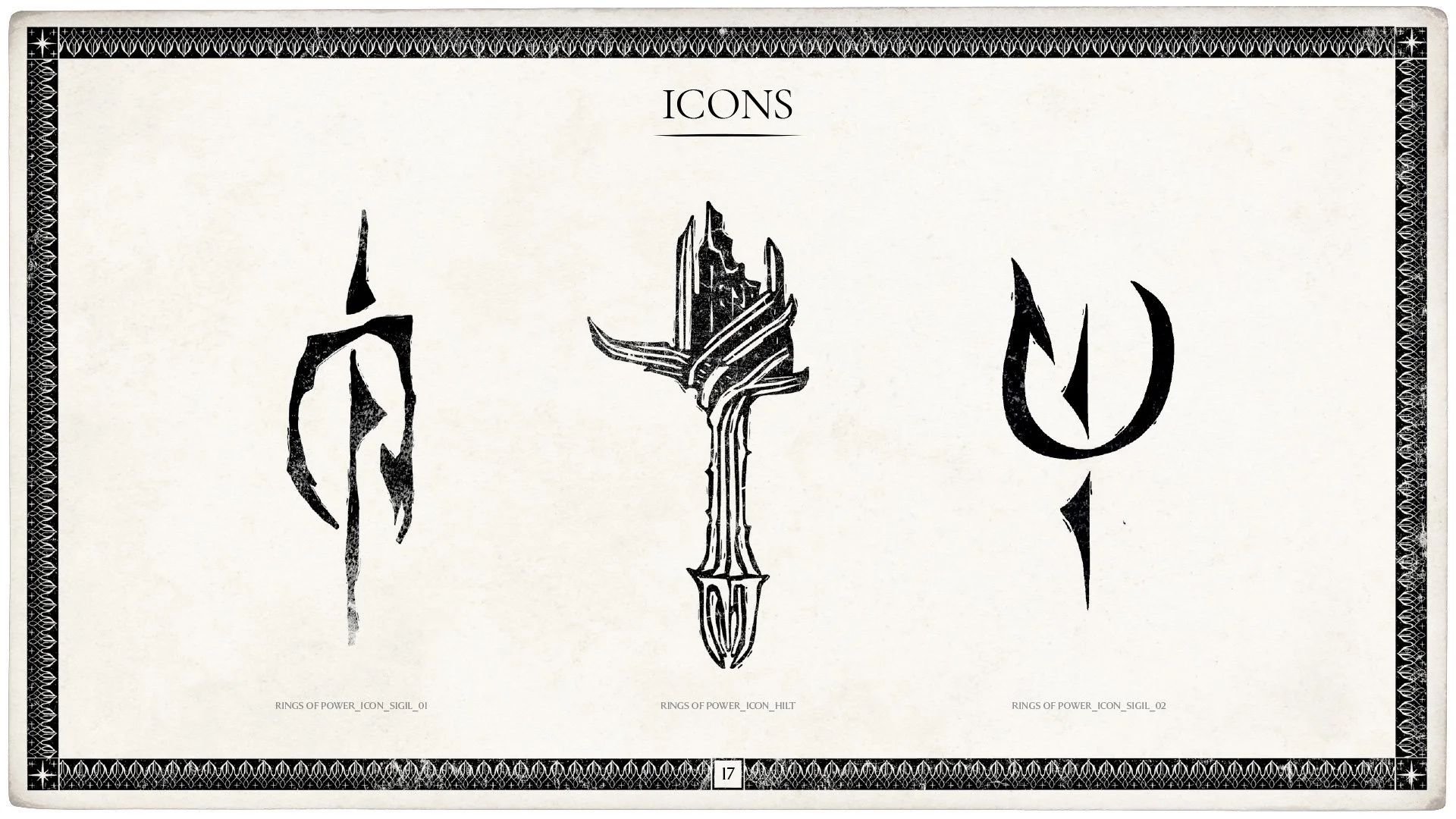
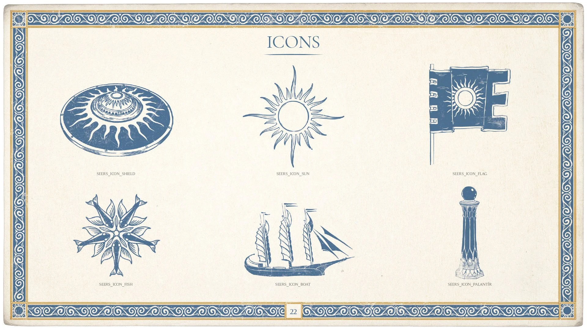
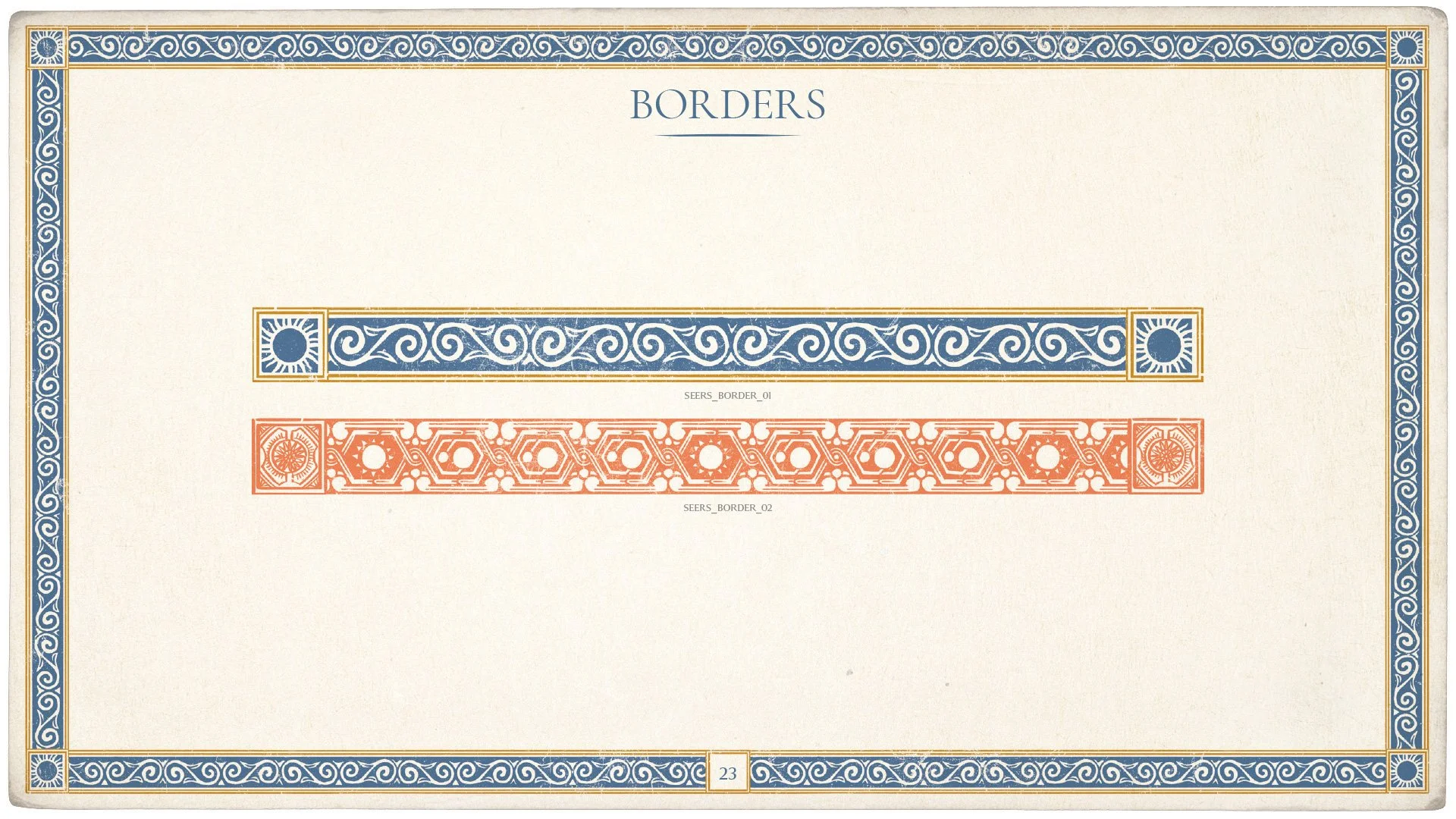
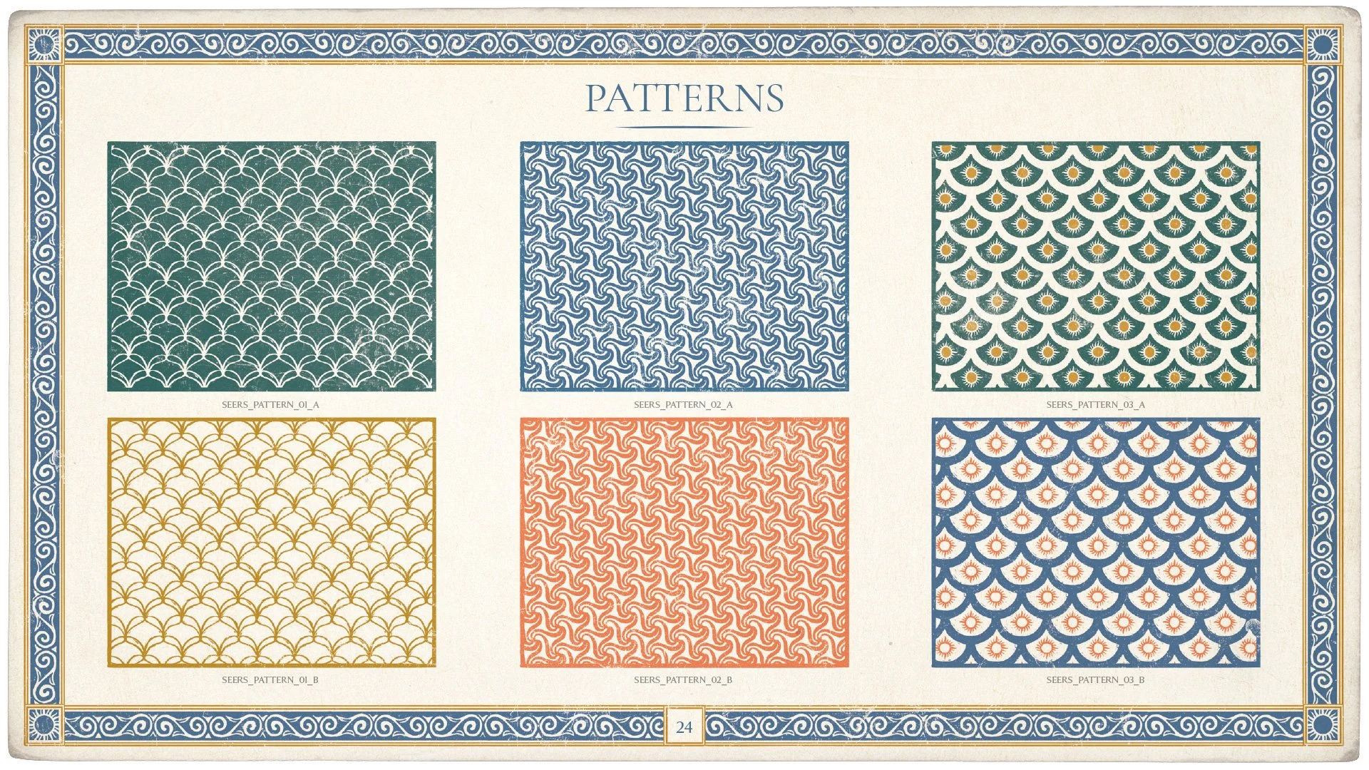
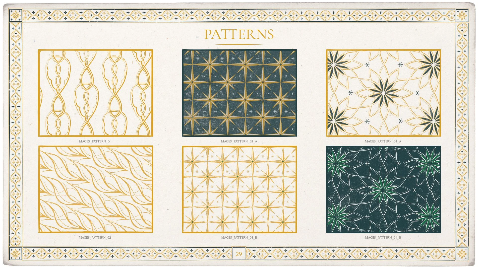
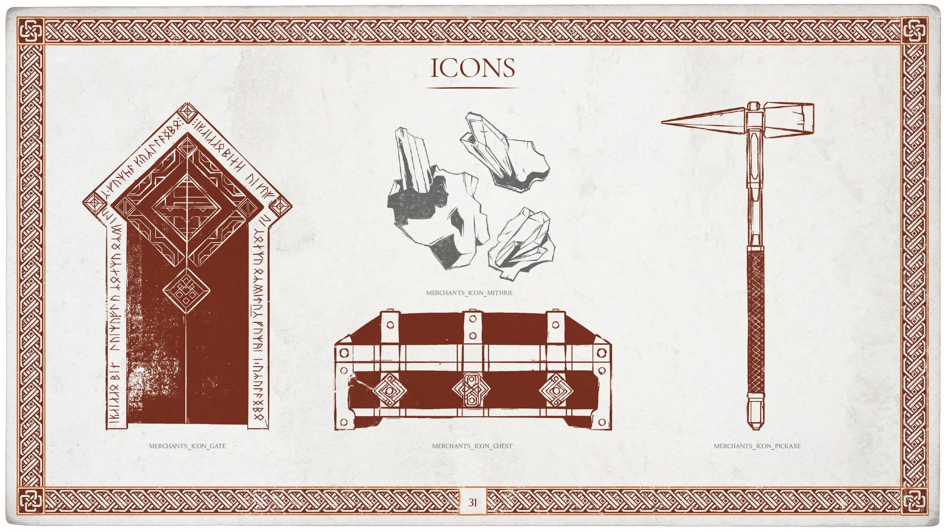
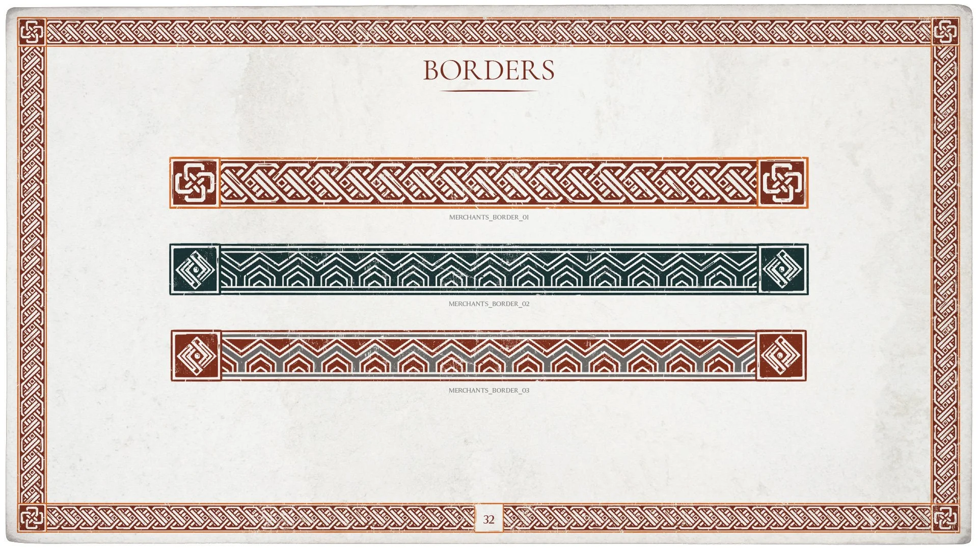
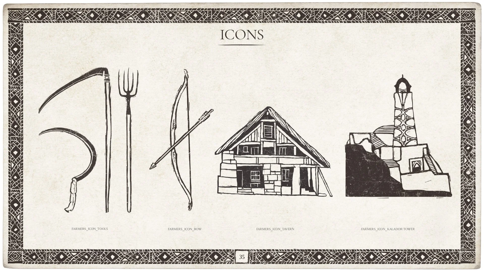
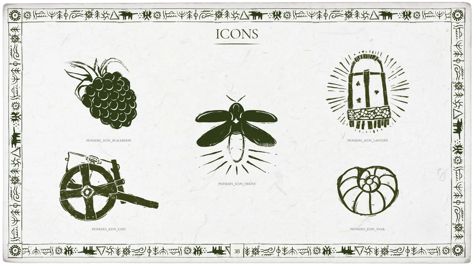
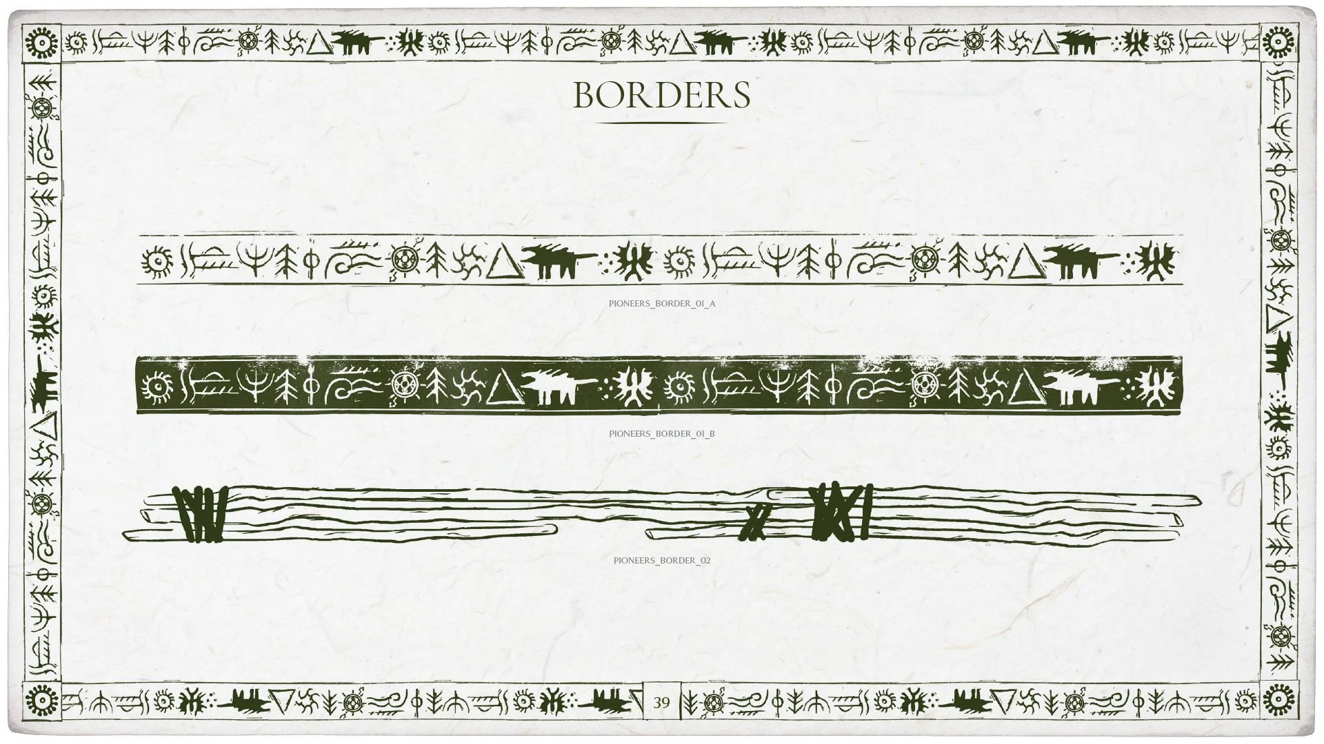
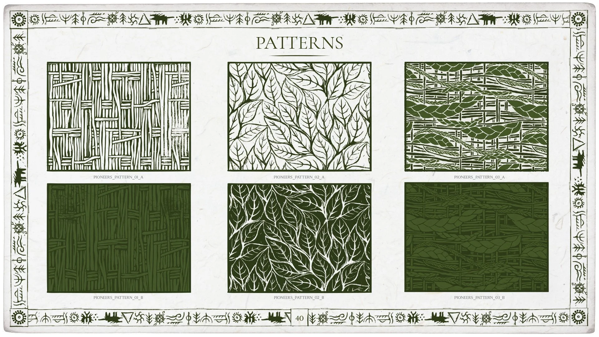
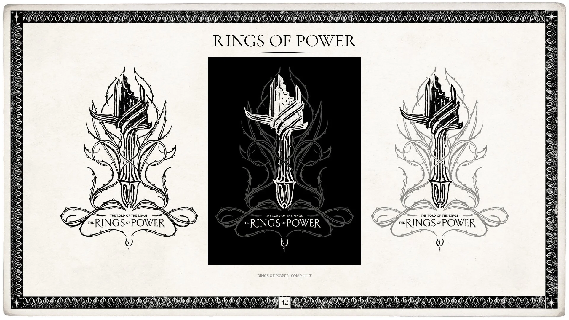
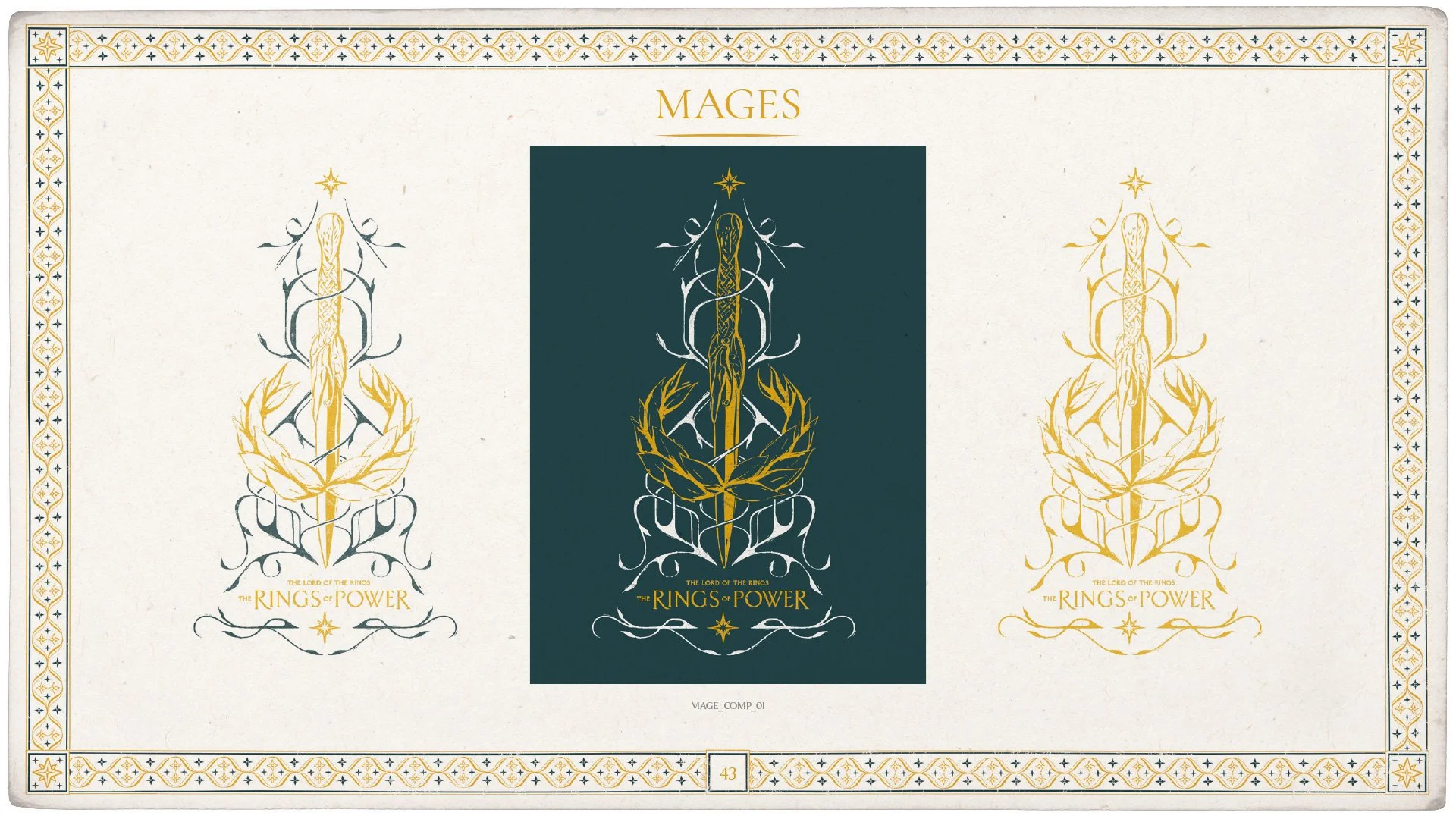
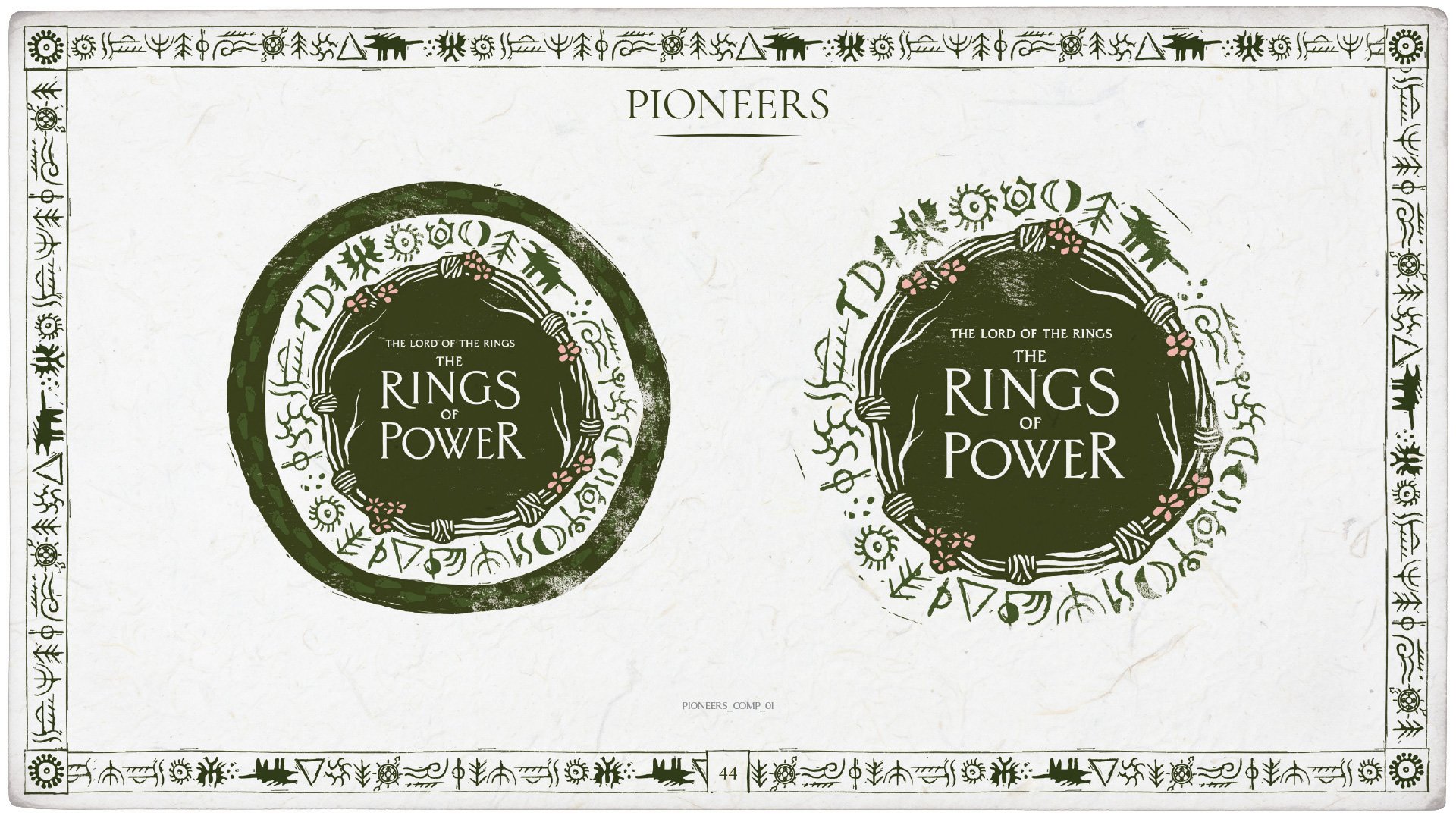
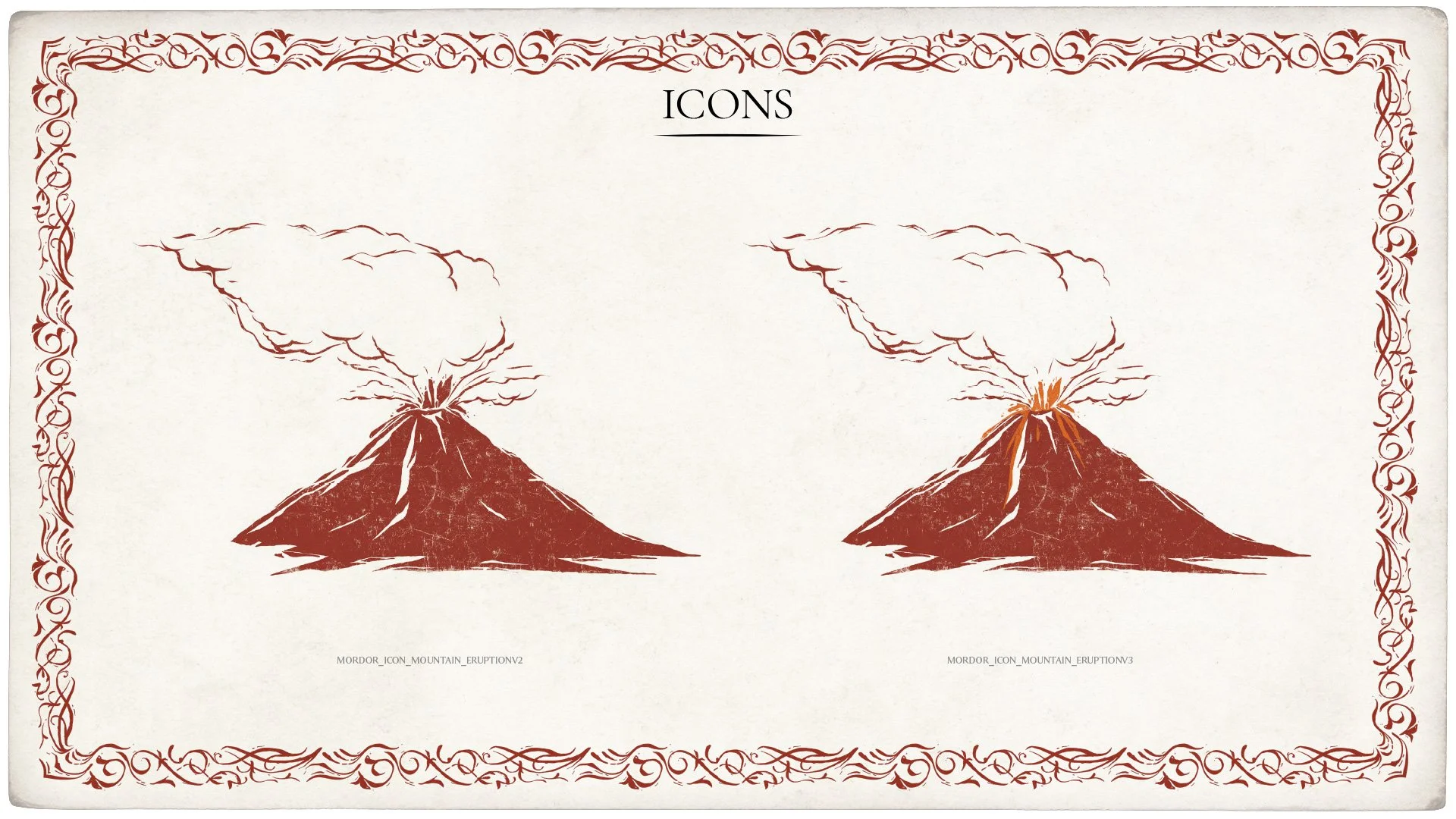
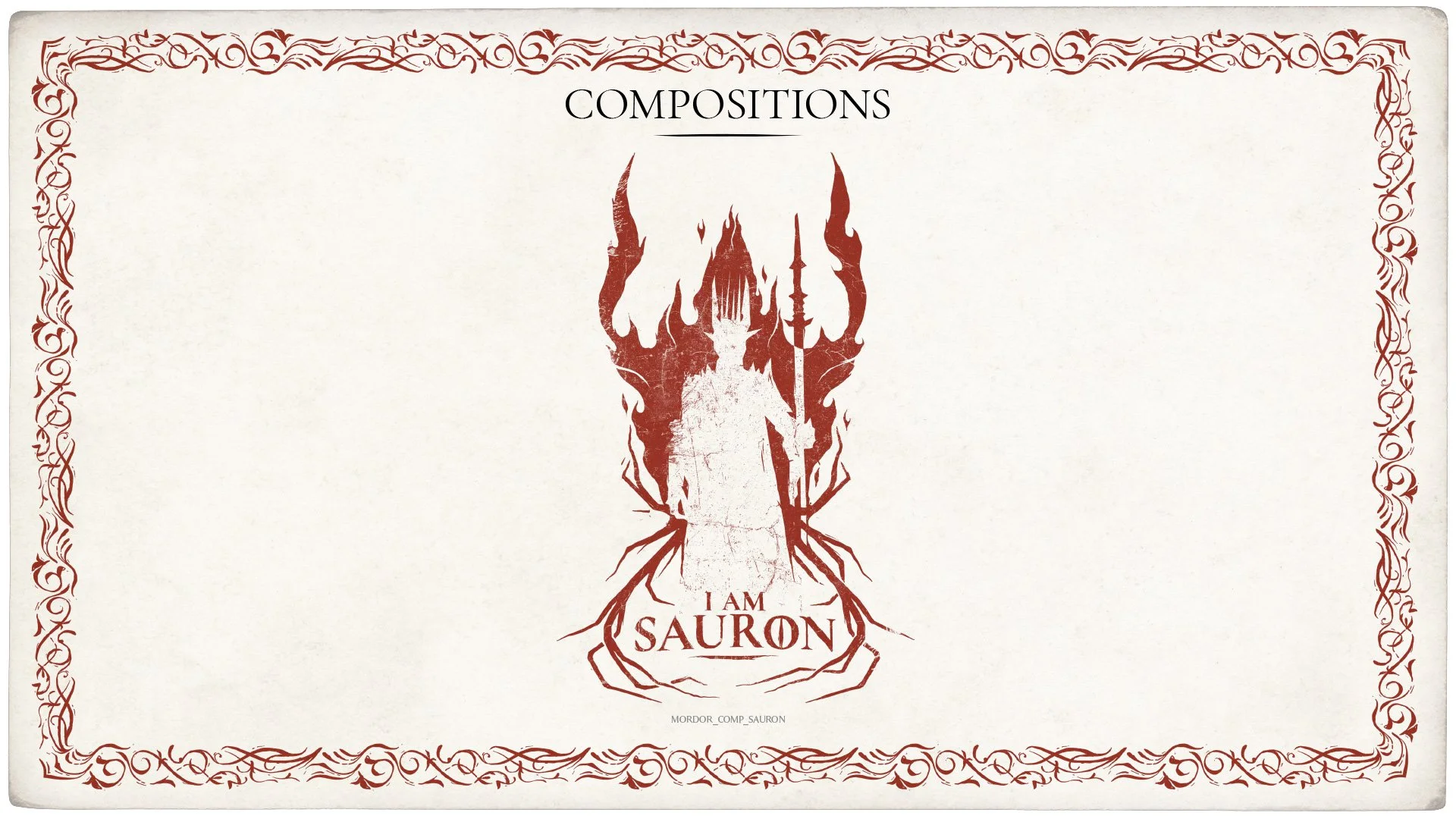
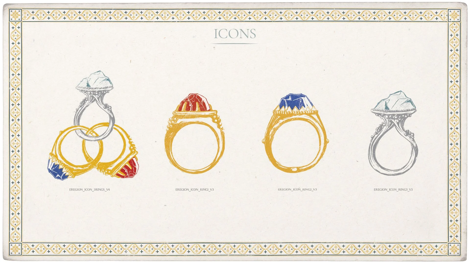
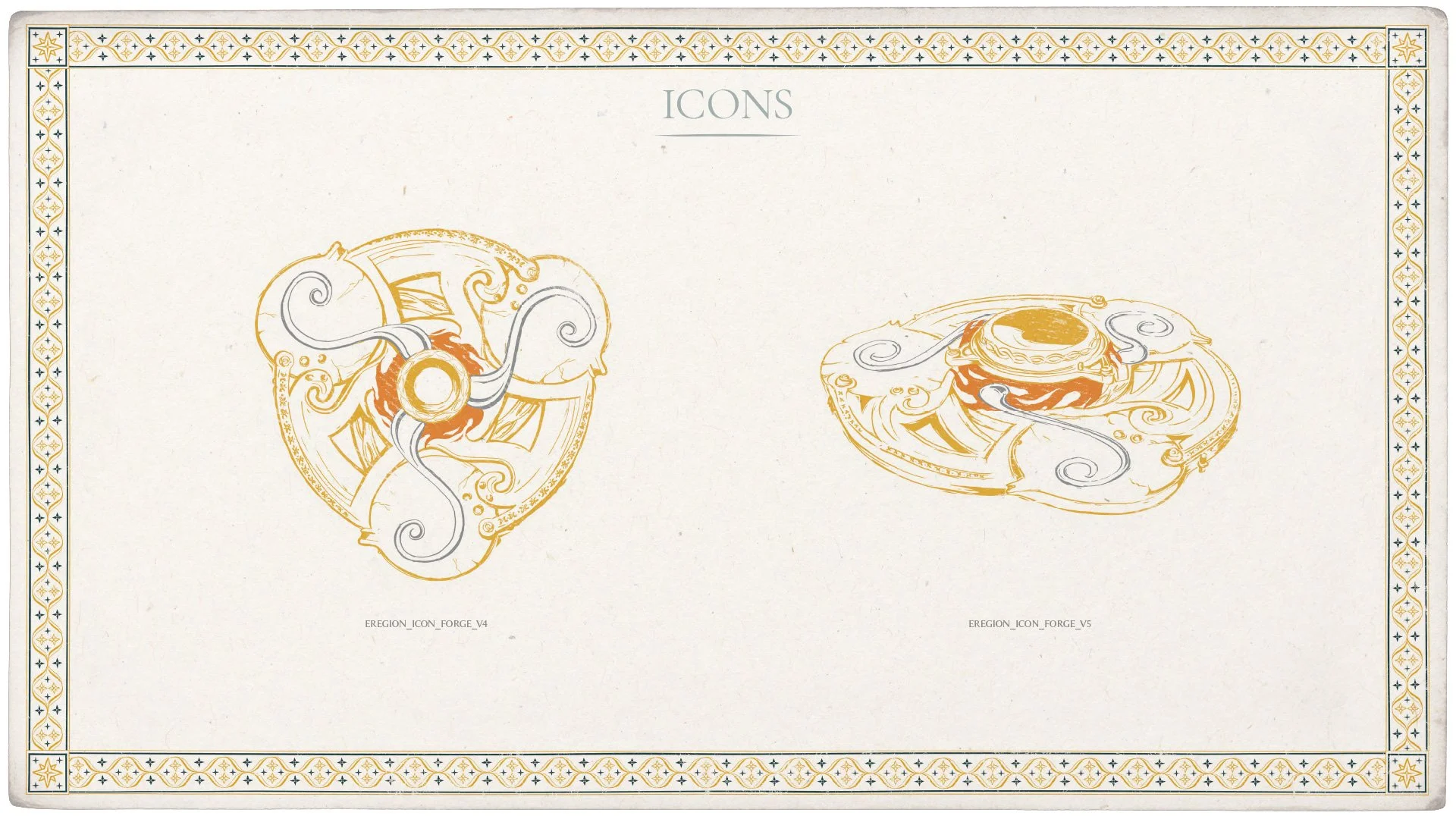
ILLUSTRATED STYLE GUIDE